
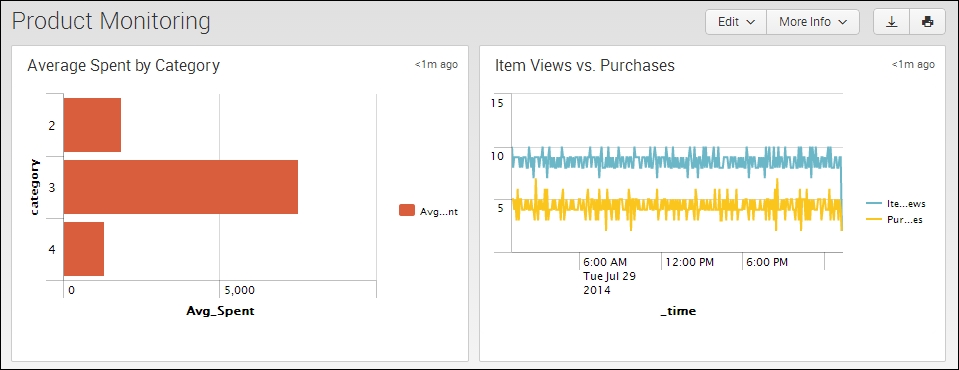
Continuing on from the last recipe, we further improve our understanding of customer activities by now looking at a chart of item views and actual purchases over a given time period. This will allow you to understand if the customers who view an item actually follow through with purchasing the given item.
In the last recipe of this chapter, you will write a Splunk search to chart item views and purchases over a given time period. You will then graphically present this data using a line chart.
To step through this recipe, you will need a running Splunk Enterprise server, with the sample data loaded from Chapter 1, Play Time – Getting Data In. You should be familiar with the Splunk search bar, the time range picker, and the Visualization tab. It is not required, but is advisable, that you complete all the recipes up until this point.
Follow the given steps to create a line chart of item views and purchases over time:
- Log in to your Splunk server.
- Select the default Search & Reporting application.
- Ensure that the time range picker is set to Last 24 hours and type the following search into the Splunk search bar. Then, click on Search or hit Enter:
index=main sourcetype=access_combined | timechart span=5m count(eval(uri_path="/viewItem")) AS Item_Views, count(eval(uri_path="/checkout")) AS Purchases
- Splunk will return a time series-based chart, listing the count of item views and the count of purchases over the given time period.
- Click on the Visualization tab and select Line from the drop-down list of visualization types to represent the data as a line chart:

- Save this report by clicking on Save As and then on Report. Name the report cp03_item_views_purchases and click on Save. On the next screen, click on Add to Dashboard.
- You will now add this to the Product Monitoring dashboard. Select the button labeled Existing, and from the drop-down menu that appears, select the Product Monitoring dashboard. For the Panel Title field value, enter Item Views vs. Purchases and select Report in Panel Powered By; then, click on Save.
- The next screen will confirm that the dashboard has been created and the panel has been added. Click on View Dashboard to see for yourself.
- Arrange the dashboard so that the line chart panel is to the right of the bar chart panel created in the previous recipe. Click on the Edit button, and from the drop-down menu, select Edit Panels. Move the line chart panel accordingly.
- Finally, click on Done to save the changes to your dashboard:
Let's break down the search piece by piece:
|
Search fragment |
Description |
|---|---|
|
|
In this example, we search for our application's logs that have the |
|
|
Using the |