
Learning the Essentials of Charts in Excel
Before you start creating charts, let's look at the two ways you can place charts in your workbooks, go over what the different components of charts are called and what they show, and get an overview of the many different types of charts that Excel offers you.
Understanding Embedded Charts and Chart Sheets
In Excel, you can place a chart either on a worksheet (for example, with its data) or on its own chart sheet:
- Chart on a worksheet. Excel calls a chart on a worksheet an embedded chart—the chart object is embedded in the worksheet. Usually, the worksheet also contains the chart's data, but you can embed a chart on a different worksheet if necessary. Create an embedded chart when you want to look at the chart alongside its data or alongside other information. Figure 7–1 shows an embedded chart.
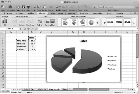
Figure 7–1. Create an embedded chart on a worksheet when you want to work on the chart or view it alongside its data.
- Chart on chart sheet. Instead of creating an embedded chart, you can create a chart on a chart sheet—a separate sheet in the workbook that contains only a chart. Using a chart sheet gives you more space to lay out the chart and view it. The chart sheet doesn't contain the source data, but you can add a data table showing the source data if you don't mind sacrificing some of the chart sheet's space for the table. Figure 7–2 shows a chart on a chart sheet without a data table.
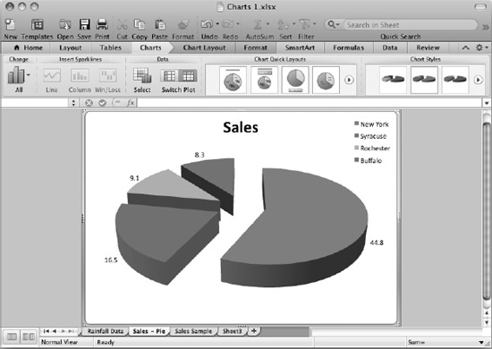
Figure 7–2. Place a chart on its own chart sheet when you want to give it plenty of space.
NOTE: You can change an embedded chart to a chart on its own chart sheet, or a chart on a chart sheet to an embedded chart, as needed. I'll show you how to do so a little later in this chapter.
Understanding the Components of a Chart
Excel's charts vary widely in looks and uses, but most of them use the same set of components. Figure 7–3 shows a typical type of chart—a 3-D column chart—of rainfall data for six months for seven weather stations, with the main parts of the chart labeled.
NOTE: If you have some sample data you're ready to turn into a chart, select the data and choose Charts ![]()
Insert Chart ![]()
Column, then click a chart type on the Column panel. This will give you a quick column chart that you can experiment with as we go through the components of charts. If you'd like to create your own version of the Rainfall Data chart used for most of the examples in this chapter, go to the Apress website (www.apress.com), locate this book's support page, and download the workbook named 35217 chart.xlsx.
The following sections discuss the individual components of charts.
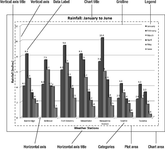
Figure 7–3. This column chart contains most of the typical elements of Excel charts. The chart area is the whole area occupied by the chart, and the plot area is where the data series are plotted.
Chart Area and Plot Area
The chart area is the whole area occupied by the chart. If the chart has a white background, the easiest way to see the extent of the chart area is to click the chart so that Excel displays a border around it.
The plot area is the area of the chart that contains the plotted data—in other words, the main part of the chart area, excluding the areas occupied by the chart title, the axis titles, and the legend (if it appears outside the plot area).
Chart Axes
Most charts have one, two, or three axes:
- Horizontal axis. This is the axis along which the data categories are laid out—for example, the weather stations in the sample chart. This axis is also called the category axis or the x-axis.
- Vertical axis. This is the axis along which the data series are laid out. This axis is also called the y-axis.
- Depth axis. In 3-D charts, this is the axis that provides the third dimension. This axis is also called the z-axis.
Each axis has tick marks that show where the values appear on it.
Categories and Data Series
The categories are the subdivisions of data that appear on the horizontal axis. For example, in the sample chart, each weather station is a category.
The data series are the sets of data used to create the chart. For example, in the sample chart, the data series contain the rainfall measurements.
Chart Title and Axis Titles
The chart title is text that identifies the chart as a whole. Normally, you put the chart title at the top of the chart, where the reader will see it immediately, but you can place it elsewhere if you want. For example, you may place the chart title in open space in the chart area so that you can make the chart itself larger.
The horizontal axis title is text that explains what is shown on the horizontal axis; for example, the weather stations in the sample chart.
The vertical axis title is text that explains what the vertical axis shows; for example, the amount of rainfall in the sample chart.
A 3-D chart can also have a depth axis title that explains what the depth axis shows.
NOTE: Chart titles and axis titles are optional, so you can include only those your chart needs. Generally, people viewing your charts will benefit from having clear chart titles and axis titles. But don't feel obliged to include any element that seems to complicate your charts. Remember the adage, “if in doubt, leave it out.”
Data Markers, Gridlines, and Data Labels
The data markers are the points on the chart that show where each data point appears. Each series typically contains several data markers. Depending on the chart type, the data markers may appear as separate points, or they may be linked together.
To make it easy to see how the data markers relate to the axes, you can add gridlines to the chart—lines that run across or up from the data markers.
Data labels are text items that display the exact value of data points. You can display data labels when viewers need to see the exact figure for each data point rather than judging the value from the chart.