
Using Color Scales
Color scales are a handy way of showing how the values in a set of cells compare to each other by setting the background color of each cell to represent its value. Excel lets you use either two-color scales or three-color scales. For example, to illustrate a range of temperatures, you could use a two-color scale with blue for the low temperatures and red for the high temperatures, or a three-color scale with blue representing an uncomfortably low temperature, green comfortable, and red uncomfortably warm. Figure 8–7 shows an example of this kind of daily temperature chart for the first half of a year.
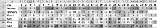
Figure 8–7. You can add impact and clarity to mundane data such as temperatures by formatting the cells with a color scale. In this worksheet, the shading for much of January, February, and March is blue, indicating colder temperatures. The shading for April, May, and June is red, indicating higher temperatures.
To create a color scale, follow these steps:
- Enter the data from which you'll create the color scale.
- Select the cells that contain the data.
- Choose
Home
Format Conditional Formatting Color Scaleto display the Color Scale panel (see Figure 8–8).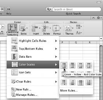
Figure 8–8. On the Color Scales panel, click the scale type you want. You can change the colors later if you need to.
- Click the type of color scale you want. Excel applies it to the cells.
Sometimes the color scale's default settings may suit your needs, but usually you'll need to adjust the color scale to change the points at which each color is used or to change the colors themselves. To adjust a color scale, follow these steps:
- With the cells still selected, choose
Home Format Conditional Formatting Manage Rulesto display the Manage Rules dialog box (shown in Figure 8–4, earlier in this chapter). - Make sure the right rule is selected. If you've applied only one conditional formatting rule to the cells, it will be selected; if you've applied multiple rules, you may need to click the right rule.
- Click the Edit Rule button to display the Edit Formatting Rule dialog box (see Figure 8–9).
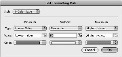
Figure 8–9. Use the Edit Formatting Rule dialog box to set the Minimum value, Midpoint value, and Maximum value for the scale. You can also change the colors by using the three Color pop-up menus.
- If you need to change from a three-color scale to a two-color scale or vice versa, open the Style pop-up menu, then click 3-Color Scale or 2-Color Scale, as appropriate.
- In the Minimum column, open the Type pop-up menu and choose Lowest Value, Number, Percent, Formula, or Percentile, as needed. Next, enter a suitable value in the Value box, either by typing it in or by clicking the Collapse Dialog button, clicking the appropriate cell in the worksheet, then clicking the Collapse Dialog button again. If necessary, open the Color pop-up menu and choose a different color.
- For a three-color scale, go to the Midpoint column, then set the type, value, and color.
- In the Maximum column, set the type, value, and color.
- Click the OK button to close the Edit Formatting Rule dialog box. Excel returns you to the Manage Rules dialog box.
- Click the OK button to close the Manage Rules dialog box. Excel applies the changes to the worksheet.