
Creating, Laying Out, and Formatting a Chart
In this section, we'll look at how to create a chart from your data, lay it out with the components and arrangement you want, and apply the most useful types of formatting.
Creating a Chart
To create a chart, you use the commands on the Charts tab of the Ribbon. Follow these steps:
- Select the data you want to chart, including any row or column headings needed. For example, click the first cell in the data range, then Shift+click the last cell. If you've downloaded the sample workbook, select cells A1:G8 on the Rainfall Data sheet.
TIP: You can create a chart from either a block range or a range of separate cells. To use separate cells, select them as usual—for example, click the first cell, then Cmd+click each of the others. Make sure that the cells contain comparable data, or the resulting chart will be odd and perhaps deceptive.
- Click the Charts tab of the Ribbon to display its contents, then click the appropriate button in the Insert Chart group: Column, Line, Pie, Bar, Area, Scatter, or Other (which contains the Stock, Surface, Doughnut, Bubble, and Radar chart types). For the sample chart, click the Column button.
NOTE: If the Excel window isn't wide enough to display multiple buttons in the Insert Chart group, a single pop-up button called All appears. Click this button to display a panel that shows all the chart types. You'll need to scroll down the panel to see most of them. When the Excel window is wide enough to display some chart-type buttons, but not all of them, you'll find the missing buttons on the Other pop-up menu.
- On the panel that opens, click the chart type you want. Figure 7–4 shows the Column panel, which is one of the most widely useful. For the sample chart, click the 3-D Clustered Column chart type.
Excel creates the chart as an embedded chart in the current worksheet, as shown earlier in Figure 7–1. You can then reposition it, resize it, or move it to a chart sheet as follows:
- Reposition the chart. If you want to keep the chart as an embedded chart, move the mouse pointer over the chart border so that it turns to a four-headed arrow, then drag the chart to where you want it.
- Resize the chart. Click to select the chart, then drag one of the handles that appears. Drag a corner handle to resize the chart in both dimensions; you can also Shift+drag to resize the chart proportionally. Drag a side handle to resize the chart in only that dimension; for example, drag the bottom handle to resize the chart only vertically.
- Move the chart to a chart sheet. If you want to move the chart to a chart sheet, follow the instructions in the next section.
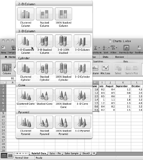
Figure 7–4. To insert a chart, click the appropriate pop-up button in the Charts group on the Insert tab of the Ribbon, then click the chart type you want.
Changing a Chart from an Embedded Chart to a Chart Sheet
You can change a chart from being embedded in a worksheet to being on its own chart sheet like this:
- Click the chart on the worksheet it's embedded in.
- Choose
Chart
Move Chartfrom the menu bar to display the Move Chart dialog box (see Figure 7–5).TIP: You can also display the Move Chart dialog box by Ctrl+clicking or right-clicking the chart and then clicking Move Chart on the context menu.
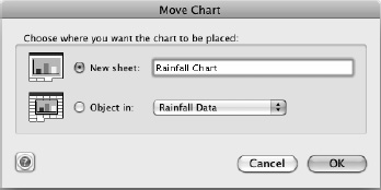
Figure 7–5. Use the Move Chart dialog box to change a chart from being embedded to being on its own chart sheet.
- Select the New sheet option button.
- Type the name for the new chart sheet in the New sheet text box.
- Click the OK button. Excel creates the new chart sheet and moves the chart to it. The chart is still attached to its source data, so if you change the data, Excel changes the chart too.
NOTE: You can also use the Move Chart dialog box to move a chart from a chart sheet to an embedded chart on a worksheet or to move an embedded chart from one worksheet to another.
Changing the Chart Type
If you find the chart type you've chosen doesn't work for your data, you can change the chart type easily without having to create the chart again from scratch. Follow these steps:
- Click the chart to select it.
- Click the Charts tab of the Ribbon to display its contents.
- In the Change Chart Type group, open the panel for the chart category, then click the chart type. For example, click the Pie pop-up button to display the Pie panel, then choose your favorite kind of pie from it.
Switching the Rows and Columns in a Chart
When Excel displays the chart, you may realize that the data series are in the wrong place; for example, the chart is displaying months by rainfall instead of rainfall by months.
When this happens, there's a quick fix: switch the rows and columns by choosing Charts ![]()
Data ![]()
Switch Plot from the Ribbon. Excel displays the chart with the series the other way around.
Changing the Source Data for a Chart
Sometimes you may find that your chart doesn't work well with the source data you've chosen. For example, you may have selected so much data that the chart is crowded, or you may have missed a vital row or column.
When this happens, you don't need to delete the chart and start again from scratch. Instead, follow these steps:
- Choose
Charts Data Selectfrom the Ribbon orChart Source Datafrom the menu bar to display the Select Data Source dialog box (see Figure 7–6).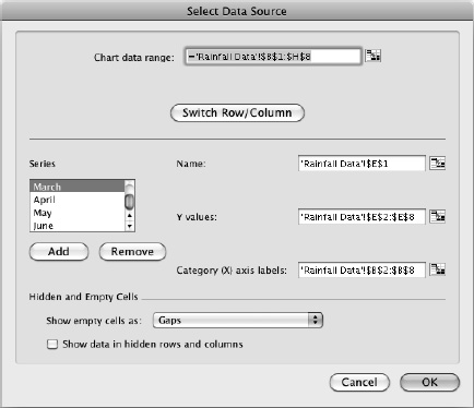
Figure 7–6. Use the Select Data Source dialog box to change the source data the chart is using.
- In the Chart data range box, enter the data range you want to use:
- Usually, it's easiest to click the Collapse Dialog button to collapse the dialog box, drag on the worksheet to select the right data range, then click the Collapse Dialog button again to restore the dialog box. (If you prefer, you can just work around the Select Data Source dialog box instead.)
- You can also type the data range in the Chart data range box. This is easy when you just need to change a column letter or row number to fix the data range.
- If you need to switch the rows and columns as well, click the Switch Row/Column button.
- If your chart data contains empty cells, open the Show empty cells as pop-up menu and choose how to represent them. Your choices are Gaps (the default setting for most charts) or Zero.
- Select the Show data in hidden rows and columns check box only if you want the chart to include data in hidden rows and columns within the source range. Normally, you'll want to keep these hidden, but it's sometimes useful to show them.
- Click the OK button to close the Select Data Source dialog box. Excel applies the changes to the chart.
Choosing the Layout for the Chart
When you've sorted out the chart type and the source data, it's time to choose the layout for the chart. For each chart type, Excel provides various preset layouts that control where the title, legend, and other elements appear. After applying a layout, you can customize it further as needed.
To apply a layout, click the chart and then click the Charts tab of the Ribbon. If a suitable layout appears in the Layouts box in the Chart Quick Layouts group, click it. To see the full range of layouts, hold the mouse pointer over the Layouts box in the Chart Quick Layouts group until the panel button appears, then click the panel button. On the Quick Layout panel that Excel displays (see Figure 7–7), click the layout you want to apply to the chart.
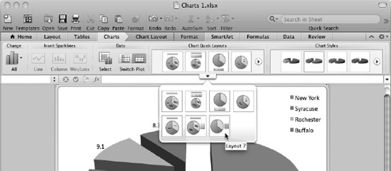
Figure 7–7. To set the overall layout of chart elements, such as the chart title and legend, open the Layouts panel, then click the layout you want.
Adding a Separate Data Series to a Chart
Sometimes you may find you need to add to a chart a data series that doesn't appear in the chart's source data—for example, to add projections of future success to your current data.
To add a data series, work from the Select Data Source dialog box. Follow these steps:
- Click the chart to select it.
- Choose
Charts Data Selectfrom the Ribbon orChart Source Datafrom the menu bar to display the Select Data Source dialog box. You can also Ctrl+click or right-click the chart and then click Select Data on the context menu. - Click the Add button below the Series list box. Excel adds a new item to the series box, giving it a default name such as Series3 or Series4.
- Click in the Name text box, then type the name you want to give the series. If the name appears in a cell on the worksheet, you can click it. When you move the focus out of the Name text box, Excel changes the default name to the name you type.
- In the Y values text box, type the values for the series inside the braces, putting a comma between the values; for example, {4.5,8.3,6.2,5.1,4.8,10.2}. If the values appear in cells on the worksheet, you can enter them by selecting the range.
- Click the OK button to close the Select Data Source dialog box.
Applying a Style to a Chart
To control the overall graphical look of a chart, apply one of Excel's styles to it from the Styles box or the Styles panel in the Chart Styles group on the Charts tab of the Ribbon. Click the chart to select it, then click the Charts tab of the Ribbon to display its controls. Either click a style in the Styles box or hold the mouse pointer over the Styles box until the panel button appears, click the panel button to display the Styles panel (see Figure 7–8), then click the style.
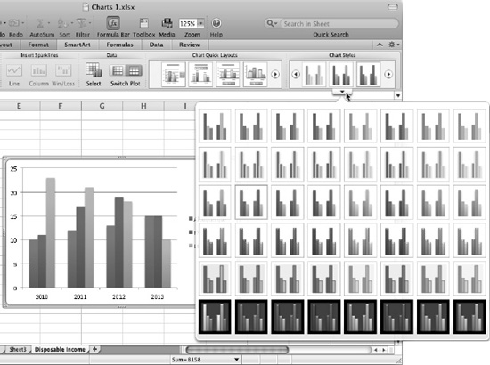
Figure 7–8. To give the chart an overall graphical look, apply a style from the Styles box or the Styles panel in the Chart Styles group of the Charts tab of the Ribbon.
Adding a Title to a Chart
To let viewers know what a chart is about, you'll normally want to add a title to it. To do so, follow these steps:
- Click the chart to select it.
- Choose
Chart Layout Labels Chart Titlefrom the Ribbon, then choose the title type you want:- No Chart Title. Choose this item to remove the existing title. You can also click the title and press Delete to delete it.
- Title Above Chart. Choose this item to place the title above the chart, making the chart smaller to provide space for the title. Use this placement when you want to keep the title clearly separated from the chart; for example, because the chart is busy.
- Overlap Title at Top. Choose this item to place the title on the chart, centered over the top. Placing the title on the chart lets you keep the chart as large as possible. If the title lands on top of data, you can click it and drag it to a different position.
- Triple-click to select the contents of the Chart Title placeholder that Excel adds for you.
- Type the title for the chart over the default text.
- If necessary, drag the chart title placeholder to a different position.
- Click elsewhere to deselect the chart title.
TIP: If you need to format the chart title, double-click the chart title to display the Format Title dialog box.
Adding Axis Titles to the Chart
To make clear what the chart shows, you'll usually want to add titles to the axes. To do so, follow these steps:
- Click the chart to select it.
- Choose
Chart Layout Labels Axis Titles Horizontal Axis Title Title Below Axisfrom the Ribbon to insert a title placeholder for the horizontal axis. - Triple-click to select the contents of the placeholder.
- Type the text for the axis title.
- If necessary, drag the placeholder to a different position.
- Choose
Chart Layout Primary Vertical Axis Titlefrom the Ribbon, then click the placement you want:- Rotated Title. Click this item to have Excel rotate the axis title 90 degrees counterclockwise so that it runs upward along the axis.
- Vertical Title. Click this item to have the axis title appear vertically, with the letters placed horizontally one above the other.
- Horizontal Title. Click this item to have the axis title appear horizontally. This placement is easiest to read, but it takes up more of the chart's space than the other two placements.
- Triple-click to select the contents of the placeholder.
- Type the text for the axis title.
- If necessary, drag the placeholder to a different position.
NOTE: If the chart has a z-axis, you can add the axis title by choosing Chart Layout ![]()
Labels ![]()
Axis Titles ![]()
Depth Axis Title and then clicking the Rotated Title item, the Vertical Title item, or the Horizontal Title item, as needed.
Changing the Scale or Numbering of an Axis
When you insert a chart, Excel automatically numbers the vertical axis to suit the data range. If you need to change the scale or numbering, follow these steps:
- Double-click the vertical axis, or Ctrl+click or right-click in the vertical axis titles area, then click Format Axis on the context menu to display the Format Axis dialog box. The Scale category appears at the front (see Figure 7–9).
NOTE: You can also open the Format Axis dialog box from the Ribbon. Click the Format tab, go to the Current Selection box, open the pop-up menu, and click Vertical (Value) Axis. Then click the Format Selection button below it. You can also click the vertical axis and choose
Format
Axisfrom the menu bar or press Cmd+1.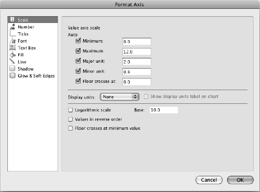
Figure 7–9. You can format an axis to control its values, major and minor units, and whether the chart shows units (such as thousands). Excel applies the changes as you work in the Axis Options category of the Format Axis dialog box.
- Use the controls in the Value axis scale area to set up the values on the axis:
- Minimum. To have Excel set the minimum value on the axis, select the Minimum check box. To set it yourself, click in the text box, then type in the value; Excel clears the check box for you.
- Maximum. To have Excel set the maximum value that appears on the axis, select the Minimum check box. To set it yourself, click in the text box, then type in the value; Excel clears the check box for you.
- Major unit. To have Excel decide the interval between major units on the axis, select the Major unit check box. To set it yourself, click in the text box, then type in the value; Excel clears the check box for you. Depending on how big your chart is, you'll probably want between five and ten major units on the scale you've set by choosing the Minimum value and Maximum value.
- Minor unit. To have Excel decide the interval between minor units on the axis, select the Minor unit check box. To set it yourself, click in the text box, then type in the value; Excel clears the check box for you. You'll normally want between four and ten minor units per major unit, depending on what the chart shows.
- In the middle section of the Scale pane, choose whether to display the units the chart uses—for example, choose the Hundreds item, the Thousands item, or the Millions item in the Display units pop-up menu. If you choose to display units, make sure the Show display units label on chart check box is selected, making Excel display a label showing the units. If you don't want to show the units, choose None in the Display units pop-up menu.
- In the lower part of the Scale pane, choose options as needed:
- Logarithmic scale. If you need the chart to use a logarithmic scale rather than an arithmetic scale, select the Logarithmic scale check box, then enter the logarithm base in the Base box. For example, enter 10 to have the scale use the values 1, 10, 100, 1000, 10000, and so on, at regular intervals.
- Values in reverse order. For some charts, it's helpful to have the values run in reverse order—for example, lowest values at the top instead of the highest. When you need this setup, select this check box.
- Floor crosses at minimum value. Select this check box if you want the floor of the chart to cross the vertical axis at the minimum value rather than at zero.
- Display units. If you want the chart to show units—Hundreds, Thousands, Millions, and so on—select the unit in this pop-up menu. Excel reduces the figures shown accordingly; for example, 1000000 appears as 1, with Millions next to the scale. This helps make the axis easier to read.
- In the left pane, click the Ticks item to display the Ticks pane (see Figure 7–10), then setup the positioning of the tick marks:
- Major Tick Mark Type. In this box, select the Inside option button to have the major tick marks appear inside the chart, the Outside option button to have them appear outside (on the axis side), or the Cross option button to have them appear on both sides. Select the None option button if you do not want major tick marks.
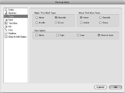
Figure 7–10. Use the controls in the Ticks pane of the Format Axis dialog box to control how the ticks on the axis appear.
- Minor tick mark type. In this box, select the Inside option button to have the minor tick marks appear inside the chart, the Outside option button to have them appear outside (on the axis side), or the Cross option button to have them appear on both sides. Select the None option button if you do not want minor tick marks.
- Axis labels. In this box, select the Next to Axis option button to have the labels appear next to the axis. Select the High option button to have the labels appear on the high side of the chart, or select the Low option button to have them appear on the low side. Select the None option button to suppress the labels.
- Major Tick Mark Type. In this box, select the Inside option button to have the major tick marks appear inside the chart, the Outside option button to have them appear outside (on the axis side), or the Cross option button to have them appear on both sides. Select the None option button if you do not want major tick marks.
- When you're satisfied with the axis, click the Close button to close the Format Axis dialog box.
Adding a Legend to a Chart
Many charts benefit from having a legend that summarizes the colors used for different data series. You can add a legend by selecting the chart, choosing Chart Layout ![]()
Labels ![]()
Legend, then clicking the placement you want: Legend at Right, Legend at Top, Legend at Left, Legend at Bottom, Overlap Legend at Right, or Overlap Legend at Left.
Each of the non-“Overlap” items reduces the chart area to make space for the legend. The two “Overlap” items place the legend on the chart without reducing its size, so they're good for keeping the chart as large as possible.
Whichever placement you use for the legend, you can drag it to a better position as needed. You can also resize the legend by clicking it and then dragging one of the handles that appears around it.
If you need to remove a legend from a chart, either click the legend and then press Delete, or choose Chart Layout ![]()
Labels ![]()
Legend ![]()
No Legend.
Adding Axis Labels from a Range Separate from the Chart Data
Depending on how the worksheet containing the source data is laid out, you may need to add axis labels that are in separate cells from the chart data. To do this, follow these steps:
- Click the chart to select it.
- Choose
Charts Data Selectfrom the Ribbon to display the Select Data Source dialog box. - Click the Collapse Dialog button to the right of the Category (X) axis labels text box to collapse the dialog box.
- Drag through the cells in the work sheet that contain the axis labels. Excel enters them in the Category (X) axis labels text box.
- Click the Collapse Dialog button again to restore the Select Data Source dialog box.
- Click the OK button to close the Select Data Source dialog box. Excel applies the labels to the axis.
Adding Data Labels to the Chart
If viewers will need to see the precise value of data points rather than just getting a general idea of their value, add data labels to the chart. To do so, click the chart, then choose Chart Layout ![]()
Labels ![]()
Data Labels ![]()
Value if you want to show the values. The Data Labels pop-up menu offers different options, depending on the chart type. For example, for pie charts, you can choose the Series Name item, the Category Name item, the Percentage item, or the Category Name and Percentage item.
CAUTION: Use data labels sparingly. Only some charts benefit from data labels—other charts may become too busy, or having the details may distract the audience from the overall thrust of the chart.
When you add data labels to a chart, Excel displays a data label for each data marker. If you want to display only some data labels, delete the ones you don't need. To delete a data label, click it once to select all data labels, then click it again to select just the one label. Then either press Delete or Ctrl+click or right-click the selection and click Delete on the context menu.
Choosing Which Gridlines to Display
On many types of charts, you can choose whether to display horizontal and vertical gridlines to help the viewer judge how the data points relate to each other and to the axes.
To control which gridlines appear, follow these steps:
- Select the chart.
- Choose
Chart Layout Axes Gridlines, then click Horizontal Gridlines, Vertical Gridlines, or Depth Gridlines to display the appropriate submenu. - Click the menu item for the type of gridlines you want to display:
- No Gridlines. Click this item to suppress the display of gridlines.
- Major Gridlines. Click this item to display only gridlines at the major divisions in the data series. For example, if your data is in the range 0–25, major gridlines normally appear at 5, 10, 15, 20, and 25.
TIP: When the viewer needs to see clearly where each value falls, use either data labels or major and minor gridlines. If using minor gridlines (with or without major gridlines) makes the chart look cluttered, use only major gridlines. Normally, it's best not to use both horizontal and vertical minor gridlines, because they tend to make charts look confusingly busy—but sometimes your charts may need them.
- Minor Gridlines. Click this item to display gridlines at the minor divisions in the data series. For example, if your data is in the range 0–25, minor gridlines normally appear at each integer—1, 2, 3, and so on up to 25.
- Major and Minor Gridlines. Click this item to display both major and minor gridlines. The major gridlines appear darker than the minor gridlines so that you can see the difference between them. Having both major and minor gridlines is usually clearer than having only minor gridlines, as you can see in Figure 7–11.
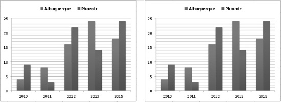
Figure 7–11. Using both major and minor gridlines (left) usually makes a chart easier to read than using only minor gridlines (right).
- Repeat steps 2 and 3 for each set of gridlines the chart needs.
NOTE: To change the values at which the gridlines appear, format the axis, as described in the section “Changing the Scale or Numbering of an Axis” earlier in this chapter.
Formatting a Chart Wall and Chart Floor
Some charts look fine with a plain background, but for 3-D charts, you may want to decorate the chart walls (the areas at the back and the side of the chart) and the chart floor (the area at the bottom of the chart). You can add a solid color, a gradient, a picture, or a texture to the walls, the floor, or both. Figure 7–12 shows a chart that uses a picture for the walls.
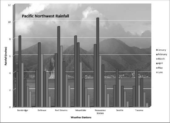
Figure 7–12. You can give a chart a themed look by applying a picture to the chart walls.
TIP: Usually, the chart walls and floors are the elements that look best with a custom fill (such as a picture). But you can apply a custom fill to many other chart elements as well. To do so, display the Format dialog box for the element, click the Fill category in the left pane, then make your choices.
To format the chart wall or the chart floor, follow these steps:
- Click the chart to select it.
- Choose
Chart Layout Current Selection Chart Elements, then click the item you want to format: Back Wall, Floor, Side Wall, or Walls (to format both the back wall and the side wall). - Click the Format Selection button in the Current Selection group to display the Format dialog box for the item you selected. Figure 7–13 shows the Format Walls dialog box with the controls for inserting a picture fill displayed.
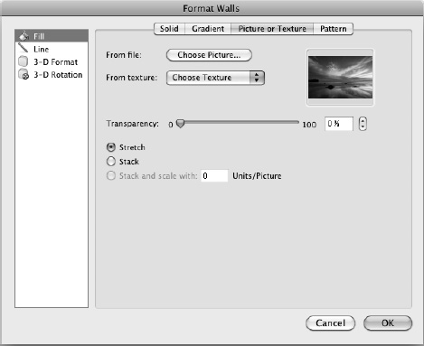
Figure 7–13. Use the Fill pane in the Format dialog box to apply a picture fill to objects such as the chart walls or floor.
- Make sure the Fill item is selected in the left pane.
- In the Fill pane, set up the fill you want:
- No fill. Click the Solid tab to display its contents. Open the Color pop-up menu, then choose the No Fill item if you want the item to be transparent.
- Solid fill. Click the Solid tab to display its contents. Open the Color pop-up menu, then click the color you want. Choose the Automatic item if you want to use the default color. Drag the Transparency slider, or type a value in the text box, to choose how transparent the fill is.
- Gradient fill. Click the Gradient tab to display its contents. Open the Style pop-up menu, then choose the gradient style you want: None, linear, Radial, Rectangular, or Path. Use the Angle knob and Direction pop-up menu to set the angle and direction of the gradient if applicable. Then, in the Color and transparency area of the Gradient tab, choose the gradient, color, and transparency.
- Picture or texture fill. Click the Picture or Texture tab to display its contents. To use a picture, click the Choose Picture button, click the picture in the Choose a Picture dialog box, then click the Insert button. To use a texture, choose it from the Texture pop-up palette. Set the degree of transparency by dragging the Transparency slide or entering a percentage in the text box. Then select the Stretch option button if you want to stretch the picture or texture to fill the space, select the Stack option button if you want to tile the picture or texture to occupy the space without distorting it, or select the Stack and scale with N Units/Picture option button to tile the picture with the number of units you type in the text box.
- Pattern fill. Click the Pattern tab to display its contents. In the Pattern box, click the pattern you want. Then choose the foreground color in the Foreground color pop-up menu and the background color in the Background color pop-up menu.
- Click the Close button to close the Format dialog box.
Formatting Individual Chart Elements
You can format any of the individual elements of a chart—for example, the legend, the gridlines, or the data labels—by selecting the element and then using its Format dialog box. This dialog box includes the name of the element it affects: the Format Data Labels dialog box, the Format Plot Area dialog box, and so on.
You can display the Format dialog box in either of these ways:
- Ctrl+click or right-click the element, then click the Format item on the context menu. This is usually the easiest way of opening the Format dialog box.
- Select the element in the Chart Elements pop-up menu, then click the Format Selection button. If it's hard to Ctrl+click or right-click the element on the chart (for example, because the chart is busy), choose
Chart Layout Current Selection Chart ElementsorFormat Current Selection Chart Elements, then click the element you want on the pop-up menu. You can then click the Format Selection button (also in the Current Selection group) to open the Format dialog box for the element.The contents of the Format dialog box vary depending on the object you've selected, but for most objects, you'll find categories such as these:
- Fill. You can fill in a solid shape with a solid color, color gradient, picture, or texture. See the section “Formatting a Chart Wall and Chart Floor” earlier in this chapter for instructions on creating fills.
- Line. You can give a shape a color border, gradient border, or no line. You can also choose among different border styles, change the border width, and pick a suitable line type.
- Shadow. You can add a shadow to the shape, set its color, and adjust its transparency, width, and other properties.
- Glow and Soft Edges. You can make an object stand out by giving it a glow, choosing a color that contrasts with the object's surroundings, and choosing how wide the glow should be. You can also apply soft edges to a shape.
- 3-D Format. You can apply a 3-D format to different aspects of a shape—for example, setting a different bevel for the top and bottom of the shape.
- 3-D Rotation. You can apply a 3-D rotation to the object.
- Font. For objects that use text, you can control how the text looks.
TIP: If the chart element contains text, you can also format it by using the controls on the Home tab of the Ribbon or keyboard shortcuts. For example, to apply boldface to the data labels, click the data labels, then choose Home ![]() Font
Font ![]()
Bold (or press Ctrl+B). This is often easier than using the Font pane in the Format dialog box for the element.