
In this recipe, we will present the estimated number of people (in millions) using a particular language over the Internet. To do this, we will include images in our line chart. Instead of writing the name of the languages, we will insert the flags, which will represent the language used. It is the first asset that we have inserted in our statistics drawings in order to make them more appealing to the sight of our students. We design the line chart, taking into account the statistics carried out in the following website: http://www.internetworldstats.com/stats7.htm.
We have an element (the image) that we are going to use in this recipe though we have to decide what to use in order to develop the line chart. We are going to carry out the activity using the following website https://documents.google.com/?hl=en#all. We have to sign in and follow the steps required in order to design a spreadsheet file. We have several options to work with the document. After you have an account to work with Google Docs, let's see how to do our line chart!
We work with Spreadsheet because we need to make calculations and create a chart. Therefore, we need to follow these steps:
- Click on File | New | Spreadsheet.
- Write the name of the languages spoken in column A.
- Write the figures in column B.
- Select the figures from column B1 up to B11. Click on Insert | Chart.
- Complete the options, as shown in the following screenshot:
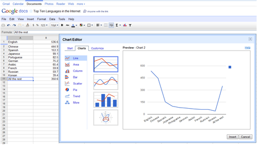
- Click on Save chart.
- Add the images of the flags belonging to the languages spoken. Then click on Insert | Image....
- Another pop-up window will appear. You may either copy the URL link in the block or use the Google image search.
- There are many warnings about copyright issues. You should look for one flag for each language and place it next to the chart that we have already designed in our document. Check that the image is free to use without copyright.
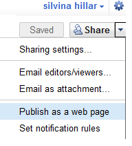
- Click on the downwards arrow in Share | Publish as a web page, as shown in the following screenshot:
- Another pop-up window appears. Click on the downwards arrow below Get a link to the published data, as shown in the following screenshot:
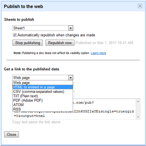
- Click on HTML to embed in a page, as shown in the previous screenshot.
- Copy the HTML code that appears in the block that reads Copy and paste the link above.
- Click on Close.
We have just designed the chart that we want our students to work with. We are going to embed the chart with the flags. If you want to design a warm up activity for students to guess or find out which are the top languages used in the Internet; you could add a chat or a forum in the course. After that, we design the activity making a link to the interactive chart in a Wiki.
Select the weekly outline section where you want to add the activity and follow these steps:
- Click on Add an activity | Wiki.
- Complete the Wiki name and Wiki description blocks.
- Click on the HTML icon and paste the HTML code that we have previously copied. Then click on Update.
- Click on Save and return to course. The activity looks as shown in the following screenshot:
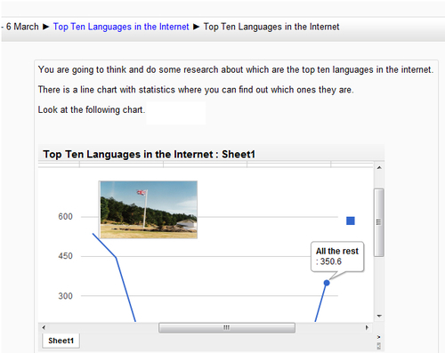
When hovering the mouse on the line chart, apart from looking at the flags, students can read the name of the language and the exact percentage of the statistic due to the fact that the chart is interactive, as shown in the previous screenshot.