
Choosing Chart Preferences
To make your charts appear the way you want, you may need to change the settings in the Chart pane in the Excel Preferences dialog box. The Chart pane contains some settings that affect only the selected chart and other settings that affect all charts.
To open the Chart pane, follow these steps:
- Click the chart for which you want to change the chart specific settings.
- Choose
Excel
Preferencesor press Cmd+, (Cmd and the comma key) to display the Excel Preferences dialog box. - Click the Chart icon in the Authoring area. Excel displays the Chart preferences pane (see Figure 7–15).
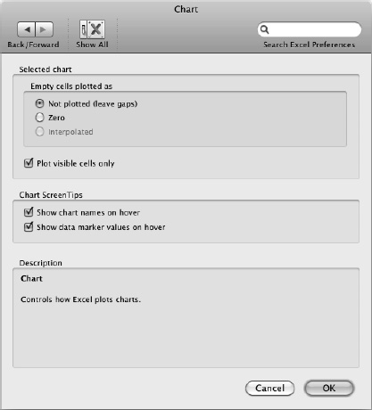
Figure 7–15. In the Chart pane of the Excel Preferences dialog box, you can choose settings for both the current chart and for all charts.
In the Empty cells plotted as box within the Selected chart area, choose how to represent empty cells in the chart:
- Not plotted (leave gaps). Select this option button to make the chart show a gap where each empty cell appears. This is the best choice for general use.
- Zero. Select this option button to make the chart show an empty cell as a zero value. In some chart types, this can help you focus on missing values that you need to supply. In other chart types, having these zero values appear is visually confusing.
- Interpolated. Select this option button if you want Excel to fill in missing values for you, basing them on the available values around them. This option button is available only for some chart types.
NOTE: Interpolating missing chart values is useful when you're working with identifiable trends. For example, if you're missing one hour's temperature measurement, and the previous hour's temperature was higher and the next hour's temperature was higher, the interpolated value appears between the two values. On the other hand, if you're missing a day's rainfall data, interpolating the value isn't sensible, because there's usually no linear relationship between one day's rainfall and the next day's.
Select the Plot visible cells only check box if you want to omit any hidden rows or columns within the chart data source from the chart. This is what you'll normally want to do. Clear this check box to make all the data show up, even if it's hidden in the data source.
In the Chart ScreenTips area, select the check boxes for the ScreenTips you want to see:
- Show chart names on hover. Select this check box to make Excel display a ScreenTip containing an item's name when you hold the mouse pointer over that item. For example, when you hold the mouse pointer over a data series, a ScreenTip shows the data series' name and details.
- Show data marker values on hover. Select this check box to make Excel display a ScreenTip showing the value of a data marker when you hold the mouse pointer over the data marker.
When you've finished choosing Chart preferences, click the OK button to close the Excel Preferences dialog box.