Optimizing tonal range, contrast, brightness, and shadows/highlights are some of the most important elements of our workflow. The following is a description of the basic correction techniques for each of these tasks. We will address image fine-tuning and more sophisticated correction techniques later.
Note
![]() We will perform all of the following corrections on adjustment or pixel layers, not on the background layer.
We will perform all of the following corrections on adjustment or pixel layers, not on the background layer.
We always correct errors that affect the entire image before we address minor and selective, local imperfections. We will discuss selective correction in more detail in Chapter 7.
Most images require some optimization of tonal range and contrast. The appropriate Photoshop tool can be found under Image ▸ Adjustments ▸ Levels. (You will be using this dialog a lot, so learn the keystroke ![]() (Mac:
(Mac: ![]() now!) This is one of the most important Photoshop functions; it allows us to alter the contrast in our images by setting the black point (Figure 4-20, slider A), the white point (slider B), and the overall brightness (slider C).
now!) This is one of the most important Photoshop functions; it allows us to alter the contrast in our images by setting the black point (Figure 4-20, slider A), the white point (slider B), and the overall brightness (slider C).
The dialog displays the distribution of brightness (luminance) values within the image from black (o, on the left) to white (255, on the right). The height of the curve represents the frequency with which each luminance value occurs.
If an image contains all luminance values between black and white, the histogram curve will stretch from the far left almost all the way to the far right of the diagram.
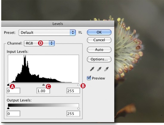
The histogram curve in our example is empty below 10 and above 220, which means that not all possible luminance values occur. We can improve image contrast by shifting the black point (slider A) to the right until it sits at the edge of the curve (here with a value of approximately 10). We then shift the white point towards the 220 value in a similar way using slider B. This significantly increases image contrast, as shown by the changes in the preview image. The colors also appear richer. All pixels that have luminance values below the black point are now displayed as pure black, and all that are above the white point are displayed as pure white.
This step maximizes the tonal range of your image. You should check to see whether the changes actually make a visual improvement.
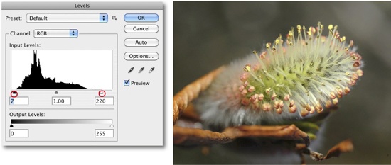
Phil Lindsay gave us this tip: Be especially careful when setting the white point, as it is all too easy to cut off fine detail in highlight areas (recognizable by a fine black line towards the right of the histogram curve).
Don’t increase contrast too much, as it is much more difficult to reduce contrast later than it is to increase it in small steps. Psychologically, a version of an image with higher contrast will attract your attention more easily than a low-contrast version of the same image, whether it is actually better or not. Printing on matte paper produces lower contrast images than printing on glossy paper. Personal and regional taste also plays a role, and Europeans generally prefer slightly less rich colors than Americans. Smaller prints (up to A3 size) are generally printed on glossy paper worldwide, while most people prefer to use matte paper for large-format prints.
Moving the white or black point sliders while holding down the ![]() key produces a real-time preview of just the clipping in the image – all other image data is masked. Generally, it is better not to clip any image data at all (except for the odd pure white or pure black pixel).
key produces a real-time preview of just the clipping in the image – all other image data is masked. Generally, it is better not to clip any image data at all (except for the odd pure white or pure black pixel).
The central slider in Figure 4-20 (C) adjusts overall brightness in your image and is also known as the Gamma slider. Use this slider with moderation and great care.
Figure 4-22. Pressing the ![]() key while moving the white and black point sliders shows the detail that will be clipped in the preview image.
key while moving the white and black point sliders shows the detail that will be clipped in the preview image.
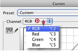
You can adjust tonal range simultaneously in all color channels or individually for red, green, and blue via the drop-down Channel menu D. Individual channel adjustments can lead to color shifts and should therefore be applied carefully.
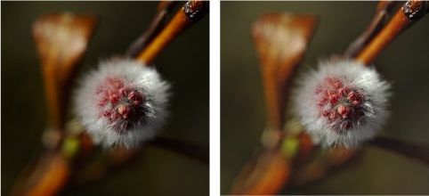
Figure 4-23 shows our image before and after setting the black and white points.

Figure 4-23. The source image is shown on the left. The image on the right shows the result of shifting the black
Clipping is a term that we will come across regularly. It describes image areas where changes in tone or color cause the differences between neighboring pixels, and thus image detail, to disappear. If we were to shift the white point in our example too far to the left (i.e., into rather than just up to the curve), we would most likely clip the image highlights, leading to burned-out highlight detail. Clipping is less obvious (and sometimes acceptable) in shadow areas, but highlight clipping is generally taboo. Always use the clipping preview (![]() or
or ![]() key) to check the effects of your black and white point adjustments.
key) to check the effects of your black and white point adjustments.
Curves is one of Photoshop’s most powerful tools. While the Levels tool only allows you to make linear corrections to the whole image, the Curves tool allows you to make extremely selective adjustments to shadow, midtone, and highlight detail. Using Curves is not particularly intuitive, but it is worth taking the trouble to learn.
Here, we will describe some of the simple but useful aspects of the Curves tool. You can adjust the color channels together or individually. Curves can be found under Image ▸ Adjustments ▸ Curves (or via ![]() (Mac:
(Mac: ![]() ). Photoshop CS3 introduced the option of displaying a histogram with the curve, making it possible to perform changes to tonal range using the Curves tool.
). Photoshop CS3 introduced the option of displaying a histogram with the curve, making it possible to perform changes to tonal range using the Curves tool.
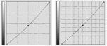
The slight “S” form of this curve improves (i.e., increases) image contrast in the midtones and usually makes additional increases in saturation redundant. You can also reduce image contrast by applying an S-curve with the opposite curvature.
Always activate the Preview option when making corrections to your images (Figure 4-24). This allows you to view the effects your changes will have without actually changing the image data.
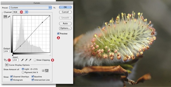
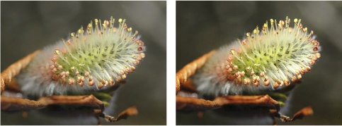
Figure 4-25. The original image is on the left. The image on the right shows the subtle) effects of applying the S-curve.
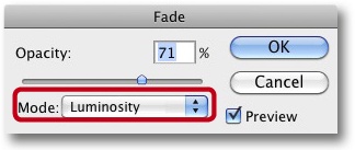
Applying an S-curve can cause color shifts, but you can counteract this effect by applying the Edit ▸ Fade tool immediately after applying the S-curve in Luminosity mode (Figure 4-26) or by applying the S-curve in Luminosity mode on an adjustment layer (Using Adjustment Layers). The Fade tool effects the last correction that was applied to the image. Mode settings are explained in Blending Modes.
You can show or hide the Curves histogram and the diagonal baseline (from bottom left to top right in the curves diagram) using the checkboxes in the Curves display options (Figure 4-24). Potential clipping is displayed by checking the Show Clipping checkbox.
You can also use Curves to adjust brightness and the distribution of brightness values in an image. We use the Curves illustrated here to do this, but feel free to experiment with the forms – even the smallest changes to the position of the control points can have quite radical effects on the look of an image.
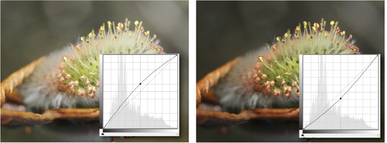
Figure 4-27. On the left is the curve for brightening midtones, and on the right is the curve for deadening midtones.
Note
![]() Clicking on a bright image area while the Curves dialog is open automatically marks the brightness of that area on the curve. You can lock the curve to this new control point by pressing
Clicking on a bright image area while the Curves dialog is open automatically marks the brightness of that area on the curve. You can lock the curve to this new control point by pressing ![]() . This helps avoid losing highlight detail by over-correcting the image (i.e., by making it too bright).
. This helps avoid losing highlight detail by over-correcting the image (i.e., by making it too bright).
Note
![]() If you want to adjust the tonal value of an area directly in the image, activate the
If you want to adjust the tonal value of an area directly in the image, activate the ![]() option (Figure 4-24), click on the appropriate point in your image, and drag the cursor up or down with the mouse button pressed. Photoshop then sets a control point with the same value as the pixel at the current cursor position. The curve can now be shifted around the new control point. This type of correction is intuitive and can also be performed on the Curves adjustment layer.
option (Figure 4-24), click on the appropriate point in your image, and drag the cursor up or down with the mouse button pressed. Photoshop then sets a control point with the same value as the pixel at the current cursor position. The curve can now be shifted around the new control point. This type of correction is intuitive and can also be performed on the Curves adjustment layer.
You can set the gridlines in the Curves dialog to 25% (Simple Grid) or 10% (Detailed Grid) increments in the Curve Display Options section of the dialog box using the ![]() buttons (Figure 4-24). If you are using the Curves adjustment layer, you can also switch between these two views by pressing the
buttons (Figure 4-24). If you are using the Curves adjustment layer, you can also switch between these two views by pressing the ![]() (or
(or ![]() ) key and clicking on the curve. We always use the detailed view.
) key and clicking on the curve. We always use the detailed view.
Setting Channel to RGB means that Curves adjustments are made to all three color channels simultaneously. You can also adjust Curves for individual color channels. This can cause color casts, but these can be counteracted by lowering (i.e., darkening) the curve around the midtones for the affected color.
You can save Curves that you use regularly in a separate settings folder.[63] This is especially useful if you want to adjust batches of images shot under similar circumstances or if you have produced a complex curve that you want to save as a Preset for future use. Photoshop CS4 and later include some preset curves which can be found in the Preset menu.
The Shadows/Highlights tool is important in our workflow, and it can be reached via Image ▸ Adjustments ▸ Shadows/Highlights. The dialog can be displayed in two versions: the compact view shown in Figure 4-28 and the extended (Show More Options) view shown in Figure 4-29. The following description is based on the extended view, which contains four options for adjusting tonal range:
Darkening extreme (nonwhite) highlights
Brightening shadows
Improving midtones
Increasing color saturation

When we make adjustments using the Shadows/Highlights dialog, we set Black Clip and White Clip (Figure 4-29) to zero in order to avoid losing shadow or highlight detail.
The most important aspect of this dialog is the shadows, which are adjusted according to three parameters:
Amount
Tonal Width
Radius
Shadows/Highlights brightens individual pixels relative to their neighbors. The radius setting determines the size of the circle within which Photoshop adjusts neighboring pixels. The exact construction of the algorithm Adobe uses is a secret, but it is obvious that it always attempts to limit changes to discreet objects. For example, a dark-colored telephone cable will not necessarily be brightened just because the radius setting says that it happens to be near a section of bright blue sky.
The Tonal Width parameter determines which tonal values are considered to be shadows, while the Amount parameter determines the strength of the adjustment that is applied.
Start by setting Amount, followed by Tonal Width. You can then play with the Radius setting until you either get the result you are looking for or start again from the top. These settings are not as complex as they might appear at first. Start with our default settings shown in Figure 4-29 and see where you end up when conducting your own experiments.

The settings for highlights work in pretty much the same way as those for shadows, but they have the reverse effect, i.e., image brightness is reduced. This doesn’t, however, affect burned-out highlights (pure white image areas) – an effect that we don’t usually want to achieve anyway.
Here, too, you can save your slider settings to a preset for later use. Saving a useful set of default values is also a good idea. The default values we use are shown in Figure 4-29.
The Midtone Contrast slider is a dream come true, allowing us to limit our adjustments to the image midtones.
If you set this slider to 0, changes in contrast will not cause color shifts. Sometimes, you want to improve color saturation with contrast, and this slider makes it possible to increase saturation for only the selected brightness value areas within the image.
The Shadows/Highlights tool is best used in 16-bit mode. It tends to produce halo effects at high contrast edges. You can counteract this effect by keeping your radius value low.
Unfortunately, Shadows/Highlights cannot be applied as an adjustment layer and can only be used on normal pixel layers.[64] We use the tool almost exclusively on our own, specially constructed assistance layer that we create using ![]() (Mac:
(Mac: ![]() ). For more details see Flattening and Merging Layers.
). For more details see Flattening and Merging Layers.