THE PAGE
94 Commentary, marginalia, and alternate languages
AS EARLY AS THE HEBREW TALMUD, commentary on the main text—indeed, layers of commentary not unlike the text threads that are everywhere online—needed to be accommodated on the page. The Talmud, a marvel of typographic structure and hierarchy, employed many ingenious techniques for incorporating commentary, which ran around the central text. More common is the practice of allowing an extra-wide margin outside of the primary text area (hence the term marginalia). In order to set the text apart even further and to respond to the narrower measure, marginalia is usually set in a smaller point size with correspondingly proportional leading; sometimes its color or slope are also different from the main text.
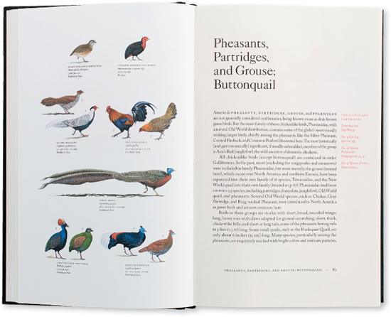
Project
Birds of the World
Art Director
Charlie Nix
Designers
Charlie Nix, Whitney Grant, and May Jampathom
Client
University of California Press
An elegant treatment of marginalia is used here to provide some info-bits about the species.
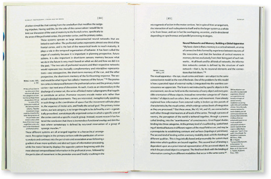
Project
Blow-Up: Photography, Cinema and the Brain
Company
Pure+Applied
Client
Distributed Art Publishers (D.A.P)
Offsets in body copy relieve the density of the text of this scholarly work and provide a framework for the narrow text blocks used for footnotes (typically relegated to the bottom of the page).
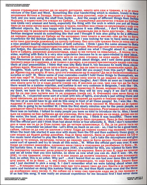
Project
Karsonwilker’s 12 Days in Serbia
Creative Director
George Mill, aka Stanislav Sharp
Client
Publikum Calendar Project
This unusual exposition of a dual-language text uses alternating lines of language in opposing colors. The reader slides an acetate insert to cover one of the two languages, so that only alternating lines are visible at any one time.