THE PARAGRAPH
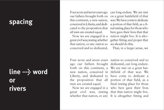
69 “Rivers” of space
GAPS THAT MOSEY THROUGH A PARAGRAPH of justified type link visually to form “rivers” of unsightly space, thereby ruining the evenness of tone (typographic color) of the text. The most common cause of rivers is a narrow column width combined with longish words. When the type is justified, word spacing increases to create the aligned edges, and when there are not enough words in a line to accommodate this adjustment comfortably, large gaps will occur. This decreases legibility; it is also a typographic eyesore.
Design Director
David Curcurito
Art Director
Darhil Crook
Associate Art Director
Erin Jang
Design Assistant
Soni Khatri
Client
Esquire
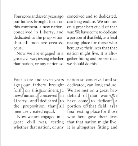
Mixing a variety of column widths skillfully, the text blocks on this page all have fine typographic color with no unsightly gaps or rivers.