THE PARAGRAPH
74 The text block effect
WORDS BEG TO BE CLUSTERED TOGETHER to form chunks. One of the many arrows in a designer’s quiver is the text block effect: look at the content and see how it can be packed inside a rectangle or square, aligned on all sides. Sometimes this can be accomplished by keeping the text all one size; other designs require massaging point sizes and varying weights and widths to achieve a solid shape. These efforts work best when the text is a single typestyle or type family.
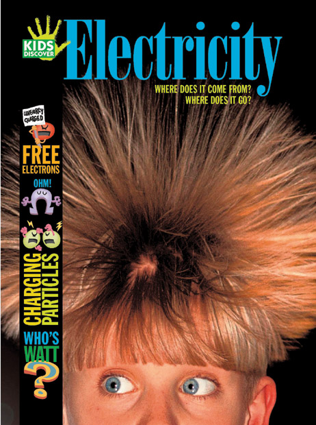
Project
Cover
Company
Hopkins/Baumann
Creative Directors
Will Hopkins and Mary K. Baumann
Designer
Preeti Menon
Photographer
Erik Vogelsang
Client
Kids Discover
Multicolored headlines stack up, interwoven with mini-illustrations, and are a lively static counterpoint for the “hair-raising” cover image.
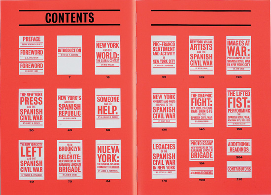
Project
Facing Fascism: New York and the Spanish Civil War
Company
Pure+Applied
Client
Museum of the City of New York
Blocks of text designed to resemble political posters are the conceit for this table of contents; the subject of the exhibition is the Spanish Civil War.
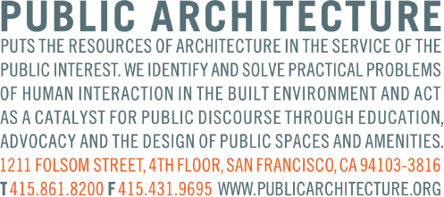
Project
Public Architecture
Creative Director, Designer
Jeremy Mende
Client
Public Architecture
Clean, balanced running text and contact information in all one size, style, and weight are headed up by the company name to form a tidy block, with contact info highlighted in red.