THE PAGE
89 The uneven text grid
AN INTERESTING TREND that goes against conventional practice is the use of uneven-width columns on the same page or within the same story. This is a step beyond the opening paragraph treatment, and it can be seen in a number of mainstream high-circulation magazines that are breaking out of the usual formats with some hits of “subversive” typography.
Project
Single page
Creative Director
Scott Dadich
Design Director
Wyatt Mitchell
Designer
Christy Sheppard
Illustrator
Kerry Roper
Client
Wired
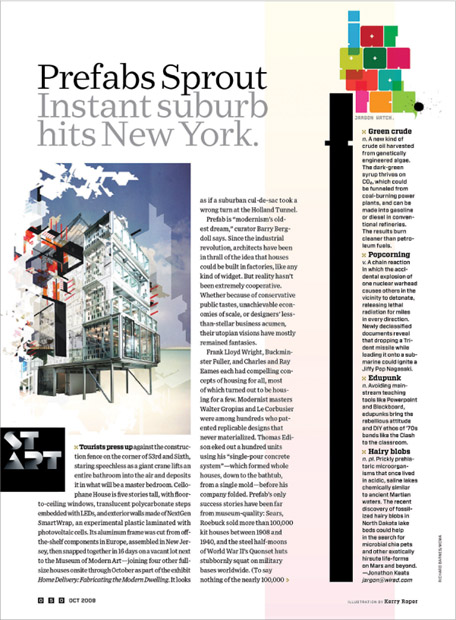
Adding a bit of extra interest to the page, this short piece of text exists in two distinct column widths. Note the extra-wide white space to the right of the narrower column and the super narrow column under the broken, overlapped, and stacked headline “Jargonator” at right (that headline is as much a piece of art as a headline; it adds a wonderful color blast topping off the column, which has no other room for art).
Creative Director
Scott Dadich
Design Director
Wyatt Mitchell
Designer
Margaret Swart
Photo Editor
Zana Woods
Photo Assistant
Sarah Filippi
Photography
Jeff Mermelstein
Client
Wired
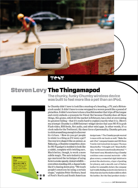
This one-pager creates some extra visual interest by using a text block (in a larger point size but with a tighter leading to match the leading of the rest of the story) that is wider and wraps around the remainder of the text, plus an outsized initial cap floating in white space, aligned with the top of the text block.