THE WORD
48 Properly weighted small caps and fractions
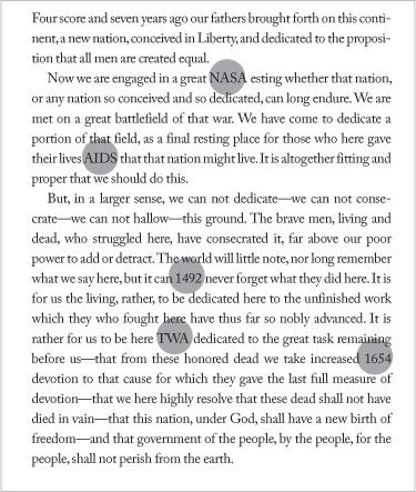
PROPORTION IS KEY when using small caps and fractions. Shortcuts to their creation provided by design software may seem easy, but any comparison of “fake” small caps or slapped-together fractions with the real thing will immediately reveal the difference. Properly weighted small caps are slightly wider and slightly weightier in addition to being shorter; this allows them to exist harmoniously within the tonal density of the surrounding text. Similarly, properly weighted (and constructed) fractions are also slightly wider and slightly weightier, and the spaces on either side of their slashes are calibrated by the type designer to match the spacing in text type.
Project
Feature spread
Creative Director
Dean Markadakis
Designer
Jana Meier
Photographer
Howard Cao
Client
Fast Company
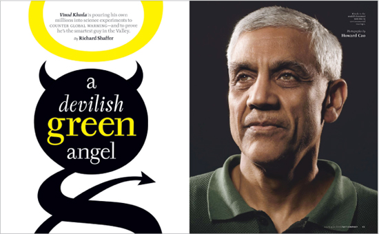
Small caps in the gray subhead match the weight of the surrounding lowercase text. Note the use of the em dash, with a comfortable space on either side of it, to set off the final thought. Also note the levels of emphasis created by an italicized name (the subject) and a roman name (the author), as well as the shifts of slope, size, and color in the all-lowercase headline. The shape enclosing the headline is a “devilish” play on the lowercase g of the word green, with its tail and horns (and halo).
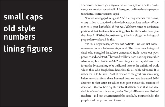
Old style numbers and groups of capitals can disrupt the consistent typographic color of a body of text. By reducing their point size slightly, consistent color can be restored.
Project (left)
Type specimen
Company
Hoefler & Frere-Jones
Designer
Jonathan Hoefler
Client
Hoefler & Frere-Jones
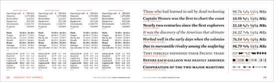
This type family from Hoefler Frére-Jones was designed with a broad spectrum of properly weighted small caps and fractions for the specific tabular uses that require them, such as stock quotes.