THE LETTER
15 Emphasis using contrasting sizes
A BROAD RANGE OF SIZES is an easy way to indicate emphasis; however, other factors come into play (see “Theory of Relativity I” on page 56). Weight, size, and character width (compressed versus expanded, for example) can affect the level of emphasis as well.
Project
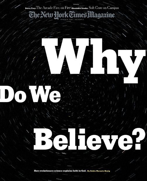
Cover
Art Director
Arem Duplessis
Art Director, Designer
Gail Bichler
Designer
Gail Bichler
Client
The New York Times Magazine
The contrasting sizes of the words of the headline highlight the Why, the key word in the title.
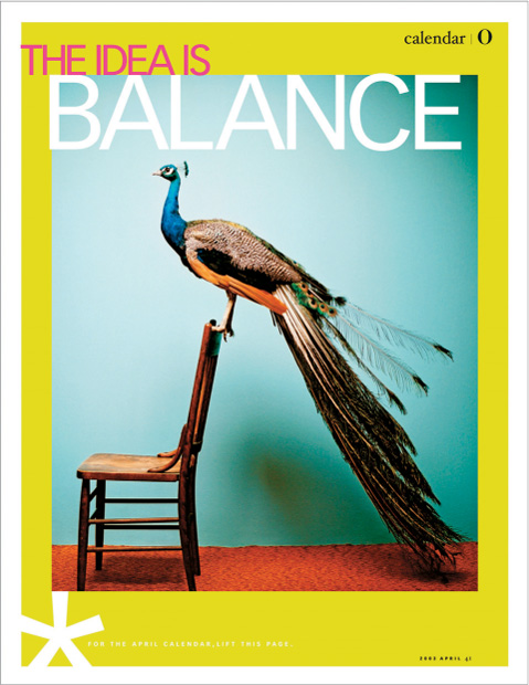
Design Director
Carla Frank
Designer
Chloe Weiss
Client
O, The Oprah Magazine
The emphasis is on BALANCE with a larger size of caps. The airy composition allows the shape of the artwork to hold court and to maximize the impossible balance of the peacock on the chair.
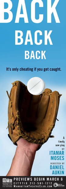
Project
Back, Back, Back
Company
SpotCo
Designer
Gail Anderson
Client
Manhattan Theater Club
The headline treatment of receding sizes of the same word creates a three-dimensional illusion of the ball traveling through space.