THE PARAGRAPH
75 Theory of Relativity III
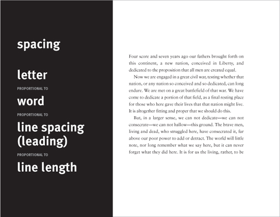
ALL TYPOGRAPHIC ELEMENTS within the paragraph have a relationship of each to every other, and all to the whole. The reader must see a clear hierarchy and elements must be legible. For a designer, balancing all of the typographic elements is one of the greatest challenges. Even slight adjustments in text characteristics (tracking, size, color, weight, slope, etc.) can clarify content.
Project
Single page
Creative Director, Designer
Steven Hoffman
Client
Sports Illustrated, The Baseball Book
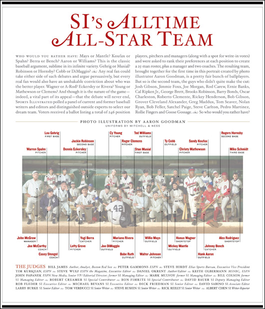
A balanced, centered layout with elegantly fine-tuned typographic details, this single page packs information densely yet effortlessly. The small caps lead-in to the body copy is simple, yet it creates a clear entry point and does not compete with the restrained flourishes in the headline. Shifts in weight, case, and color clarify content and hierarchy in the player identification and the copy block below identifying the judges.
Project
Feature spread
Creative Director
Dean Markadakis
Designer
Jana Meier
Photographer
Howard Cao
Client
Fast Company
This spread contains a great deal of information, and its elements all support one another. For example, the serif weight on the initial cap matches the weight of the horizontal bar with dropout type, which introduces the sidebar. The black and yellow of the dotted rule is repeated in the dingbats illustrating the sidebar. The three-column, justified format has good weight and even color, and provides enough entry points to make certain the reader feels invited into the text.