THE PAGE
77 Legibility taking a back seat
THERE ARE REASONS WHY legibility might not be a designer’s primary concern. When type is treated as an image, it can communicate on a different level. Type can be manipulated or used in such a way that it is difficult or impossible to read and still play a pivotal role in the reader’s understanding of the text.
Project
Feature spread
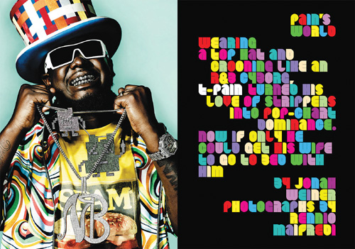
Creative Director, Designer
Dirk Barnett
Photographer
Rennio Maifredi
Client
Blender
This artist’s appearance was clearly the inspiration for the opposite text treatment; a youthful audience of music lovers will undoubtedly be more interested in appearances than content (as it takes a great deal of effort to decipher this text).
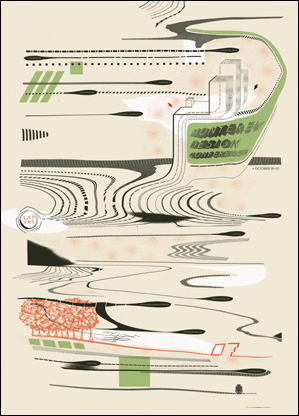
Design Director
Jeremy Mende
Designers
Amadeo DeSouza, Steven Knodel, and Jeremy Mende
Client
American Institute of Architects, California Council (AIACC)
This poster for a design conference does provide some basic information, but it must be searched out amid the woozy graphics; since the readers are likely an audience of designers, they are probably willing to make the effort.
Project
Poster
Company
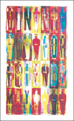
Henderson Bromstead Art Co.
Client
Triad Health Project
The text is so embedded in the gridded imagery that we can scarcely make it out, but it is repeated at the bottom left. The poster is coveted as memorabilia from the event, but it “pushed the decorative envelope,” says the designer.