THE LETTER
1 Using letter as form
EACH LETTER IS A SHAPE UNTO ITSELF, a shape that may serve as an illustration, as an icon, as a vessel, or as a graphic focal point, apart from its meaning as an alphabetic unit. Especially when used at very large sizes, the extreme proportions of letterforms can have exceptional impact—this technique has been exploited very effectively by many successful designers.
Letters can be expressive when used alone, as a simple silhouette, as an outline, or as a container for image, texture, or pattern. The beauty and power of the individual form may also be used partially: or a shape that is sliced and diced, cropped, or reversed horizontally or vertically. Because it is a letterform, it has a built-in relationship with any typeface that accompanies it. Its inherent integration unifies the design of the whole piece.
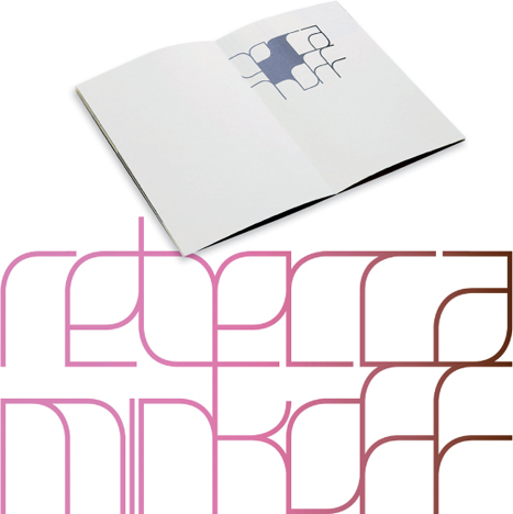
Project
Rebecca Minkoff Couture
Identity Concept
Design Studio
Remake
Art Director, Designer
Michael Dyer
Client
Rebecca Minkoff
This custom-lettered logo forms a discrete shape, but within its boundaries, each letter is delicate and leaf-like. The delicacy is further underscored by the pastel color gradation. The logo also appears with some of its counter spaces filled with a similar hue.
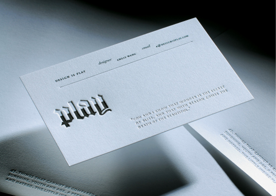
Designers
Angie Wang and Mark Fox
Client
Design Is Play
This deeply debossed logo composed of blackletter type is partially “blind” (or empty) and partially filled with color, reminiscent of a glass half full. The use of the individual strokes of the letters as vessels for color elevates its memorable quality and adds to the dimensionality of the embossing process.
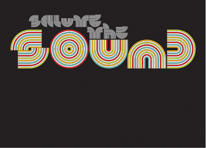
Project
Salute the Sound
Design Director
Paul Sych
Typographer
Paul Sych
Client
Bass the Beat Productions
These letterforms are beautiful abstractions, chunky ribbons of color. It is amazing that we can actually read this phrase, given how spare the forms are. The letterforms suggest the vinyl ridges of an album or LP.