THE PAGE
80 Six necessary typefaces
THE MORE TYPOGRAPHIC CHOICES WE HAVE as designers, the harder it is to practice restraint. But imagine a time when typefaces were made of metal, and they were so laborious to produce and to use that the choices were very limited. It is reminiscent of the early days of broadcast television, when a few networks had a monopoly on our viewing attention. Now, with digital and cable television technology available almost everywhere, with hundreds of choices, we often feel there is nothing of interest to watch. Similarly, a few typefaces may be all we really need in our repertoire.
Some well-known and highly regarded designers have advanced the argument that perhaps as few as six typefaces might be enough for every possible design contingency. Those typefaces would certainly include widely used and highly recognizable classics such as Caslon, Garamond, Baskerville, Helvetica, Futura, and Gill Sans. Depending on the designers and their personal preferences, the six typefaces might vary somewhat (but the notion of six “necessary” typefaces should be considered a viable one).
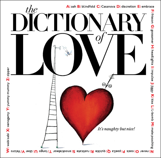
Project
The Dictionary of Love
Company
Hopkins/Baumann
Creative Directors
Will Hopkins and Mary K. Baumann
Client
Avon Books
Bodoni and Gill Sans—two of the typefaces on most short lists—are on this cover.
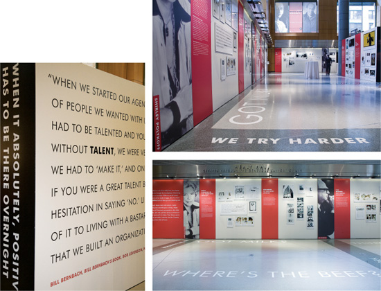
Project
Exhibition design
Design Director
Jill Ayers
Designers
Rachel Einsidler and Christine Giberson
Client
The One Club for Art & Copy
The entire exhibition was done with Futura, one of the six useful typefaces that would make even a minimalist’s cut.