THE LETTER
8 The handmade solution
IN OUR INCREASINGLY TECHNICAL WORLD, there has been a huge backlash against the machine-made aesthetic. Handmade forms appeal to our humanity, and the enormous popularity of handmade objects reflects the do-it-yourself spirit of our times. Even large corporations are using hand-drawn letterforms (or typefaces that are designed to resemble hand-drawn letterforms, containing a panoply of alternate characters) to warm their chilly images. The MTV logo is an example of the renegade or counterculture aspect of hand-drawn letters, as is the psychedelic lettering that typified the ’60s, or the deliberately rough and exuberant hand lettering of the Moulin Rouge posters.
The handmade solution is a display-only solution, for the irregularity and quirkiness of form and material inhibits the legibility of text passages. But when used judiciously and with restraint, handmade letterforms can infuse the content with emotion.
Irregularity of handmade and hand-drawn typographic forms can be particularly effective in conveying qualities such as playfulness, originality, authenticity, rebellion, and spontaneity, or to signal an organic nature. These forms suggest that they were customized, created for a singular purpose, not intended to be replicated. These “personalized” implied aspects add to the perception of the content as unique, appealing to the reader in a more visceral way than any out-of-the-box typography. Thus the reader may be made to feel that the act of reading is more satisfying and creative, more personally touching.
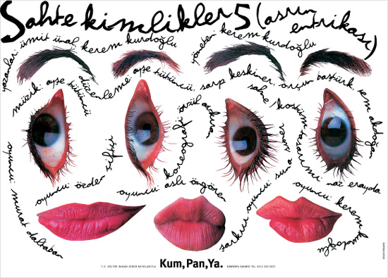
Project
Theater poster
Designer, illustrator
Bülent Erkman
Letterer
Bilge Barhana
Photographer
Fethi Izan
Client
Kum, Pan, Ya Theatre Group
Rough script handwriting creates texture, shape, and “facial” framework for the images in addition to providing information. The hand-drawn lettering adds to the surrealist effect of the silhouetted eyes, lips, and eyebrows.
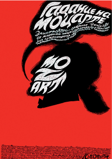
Designer, illustrator
Eric Beloussov
Letterer
Dmitriev Nick
Client
Cultural Centre Dom
Flamelike hand-drawn typographic forms mass together in a red, white, and black palette to create an ominous and threatening look. A unified approach using scratchboard technique for both art and text offers a powerful example of how effective this approach can be; the intricately fitted, custom-shaped text blocks would have been impossible to create using conventional typography.
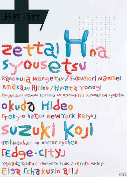
Project
Promotional poster
Designer
Norito Shinmura
Client
Yasei Jidai (“Wild Age”)
Publisher
Kadokawa Shoten Co., Ltd.
From a series of promotional posters, these letterforms are delightfully playful, crafted from a traditional children’s party entertainment of balloon toys. A careful examination reveals that the balloon forms are unique and varied, lending a charm and warmth that is appealing to one’s inner child.