THE WORD
32 Hierarchy using contrast
HIGHER CONTRAST SEPARATES background from foreground. Separation can also be emphasized using outlines, hard drop shadows, soft drop shadows, and any combination of these effects. Especially when there is a complex background, whether an image or typographic texture, extra care must be taken to create sufficient contrast between the type and what is behind it.
Project
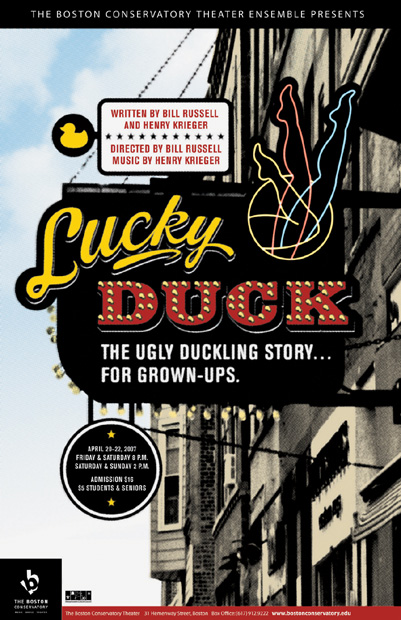
Show poster
Company
Alphabet Arm Design
Art Director
Aaron Belyea
Designer
Ryan Frease
Client
The Boston Conservatory
A “faux” sign provides a strong background contrast for the text; an interesting mix of styles uses outlines and drop shadows to stand out.
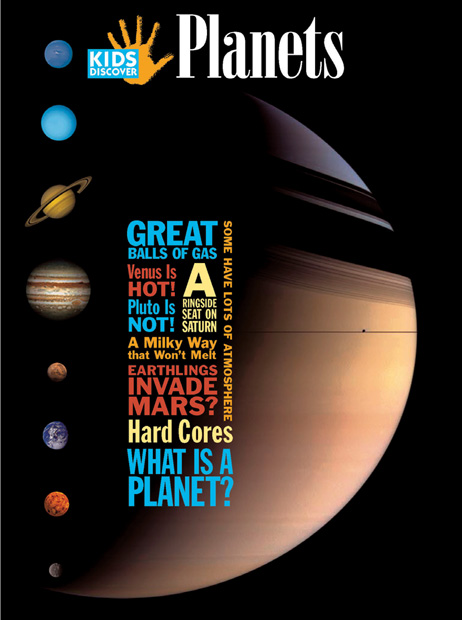
Project
Cover
Company
Hopkins/Baumann
Creative Director
Will Hopkins and Mary K. Baumann
Designer
Wenjun Zhao
Images
Saturn: Nasa/JPL/
Space Science Institute
Planets: Medialab, ESA
Client
Kids Discover
Hierarchy is created here using size and weight, but moderated by color. For example, though some of the text in blue is larger, the smaller text, some of which is in shades of gold and yellow, stands out more because its relative contrast against the background is greater.
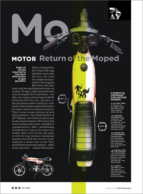
Creative Director
Scott Dadich
Design Director
Wyatt Mitchell
Designer
Margaret Swart
Photo Editor
Zana Woods
Photo Assistant
Sarah Filippi
Photography
Todd Tankersley
Client
Wired
Generally, white text on a black background is widely considered to be the ideal for lengthy passages of text. Large quantities of white body copy on a black background can be difficult for many readers due to a “sparkle” effect. But, with proper attention to style, weight, and size, it is possible for a modest length of text to be legible and comfortable to read. Here, white sans serif text on a black background works; at this size, and with no thin serifs to “disappear” into the inky depths, all of the text is functional.