THE WORD
30 Hierarchy using weight
FATTER IS MORE VISIBLE. Letters that have wider stems and stroke widths have a stronger presence on the page. Weightier forms may supersede position and size as a determinant of hierarchy; however, typographic hierarchy is relative, therefore it depends on how weighty versus how big versus how prominently positioned (see “Theory of Relativity II” on page 106).
Project
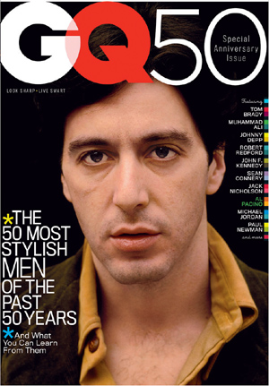
Cover
Design Director
Fred Woodward
Designer
Thomas Alberty
Director of Photography
Dora Somosi
Photographer
John Bryson
(Time Life Pictures/Getty Images)
Client
GQ
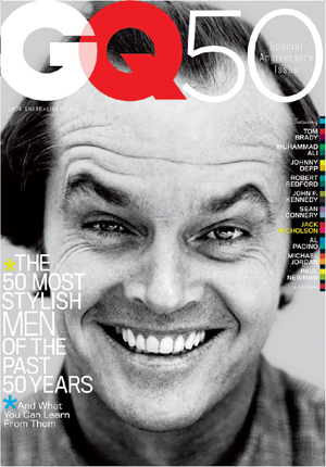
Project
Cover
Design Director
Fred Woodward
Designer
Thomas Alberty
Director of Photography
Dora Somosi
Photographer
Snowden
(Camera Press/Retna Ltd)
Client
GQ
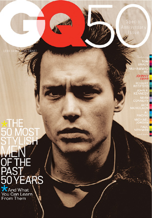
Project
Cover
Design Director
Fred Woodward
Designer
Thomas Alberty
Director of Photography
Dora Somosi
Photographer
Anton Corbijn
Client
GQ
These special issue covers use a shift in weight to separate the magazine’s name and its anniversary without using a space between the two. Also of note is the highly consistent formatted typography on all covers with the color bars (bleeding off the edge) anchoring the flush-right cover lines, and the repetition of the cover lines at left, down to the blue asterisk, in exactly the same size, color, and position. The intent is to link all covers visually the special occasion of the anniversary. The portraits provide the variety and visual punch.
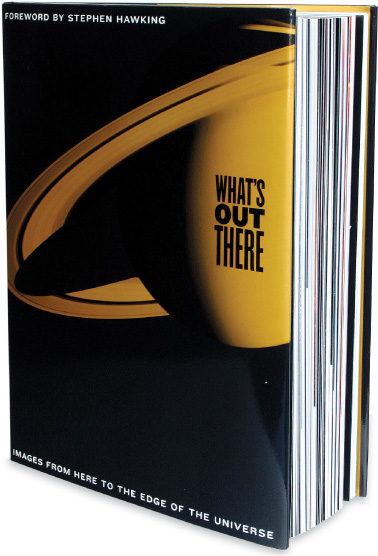
Project
What’s Out There: Images from
Here to the Edge of the Universe
Company
Hopkins/Baumann
Creative Directors
Will Hopkins and Mary K. Baumann
Images
Nasa/JPL/Space Science Institute
Client
Duncan Baird Publishers
The stacked title employs weight as well as width to create a justified block of text; the word OUT is emphasized by its weight, though the letters are much smaller.
Project
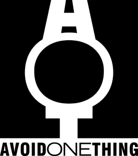
Avoid One Thing
Company
Alphabet Arm Design
Designer
Aaron Belyea
Client
SideOneDummy Records
The logo and its legend both use a weight shift (and a shift in width) to separate and emphasize. Interestingly, the wider word ONE appears more prominent than the weightier words on either side, though the point size is the same, perhaps partly because it is centered.