THE WORD
46 Mixing typefaces using historical compatibility
TYPE DESIGN REFLECTS ITS ERA, so multiple typefaces within a single project should be historically compatible, i.e., designed within a similar time frame, or a revival from that time frame. Another method for choosing typefaces that are historically compatible might be to choose from the designs of a single type designer. As with all type choices, the faces should work with the content; historical considerations are not the only factor.
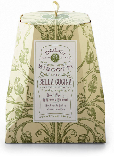
Project
Package
Art Director, Designer
Louise Fili
Client
Bella Cucina
Dolci Biscotti packaging was designed using various Victorian-era typefaces that were scanned from old type books and redrawn.
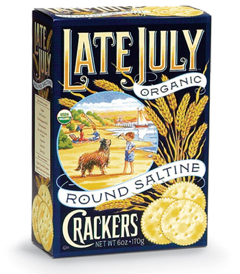
Art Director
Louise Fili
Designers
Louise Fili and Chad Roberts
Illustrator
Graham Evernden
Client
Late July
The Late July package was inspired by early twentieth-century cracker packaging. Everything was hand lettered, including the net weight copy.
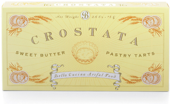
Project
Package
Art Director
Louise Fili
Designer
Louise Fili
Client
Bella Cucina
The principal type for this packaging, which is used for virtually all Bella Cucina products, is derived from an early twentieth-century French typeface.