THE PARAGRAPH
57 Tracking guidelines
NOT TOO LOOSE AND NOT TOO TIGHT: tracking should feel “just right” (in the words of Goldilocks as she fell asleep in the baby bear’s bed). Tracking refers to the overall or global adjustment of letter spacing within a word, a line, a paragraph, or a passage of text. As in all things typographic, the goal is consistency in the appearance of the text. Therefore, it is generally best to practice restraint in tracking, so that there appears to be little difference between the text that has been altered (tracked in or tracked out, as the case may be) and the text that surrounds it.
Project
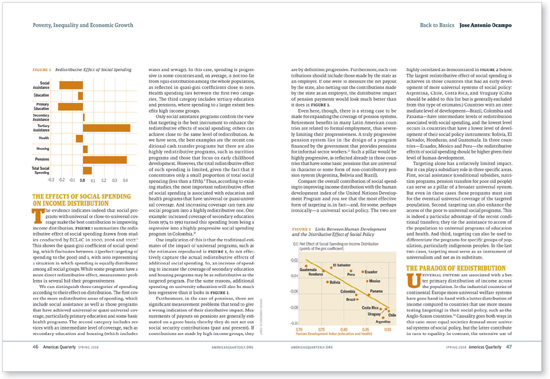
Feature spread
Creative Director
Donald Partyka
Illustrator
Jared Schneidman
Client
Americas Quarterly
The even and highly legible tonality of the text columns look consistent throughout; this is the gold standard of well-set body copy.
Company
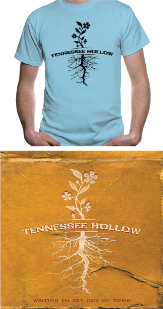
Alphabet Arm Design
Art Director
Aaron Belyea
Designer
Ryan Frease
Client
Tennessee Hollow
This logo has tight tracking of its wide letterforms and is slightly curved; its strong horizontality provides a counterpoint to the (vertical) plant above it and the roots below it.