THE PARAGRAPH
51 Invisible typography
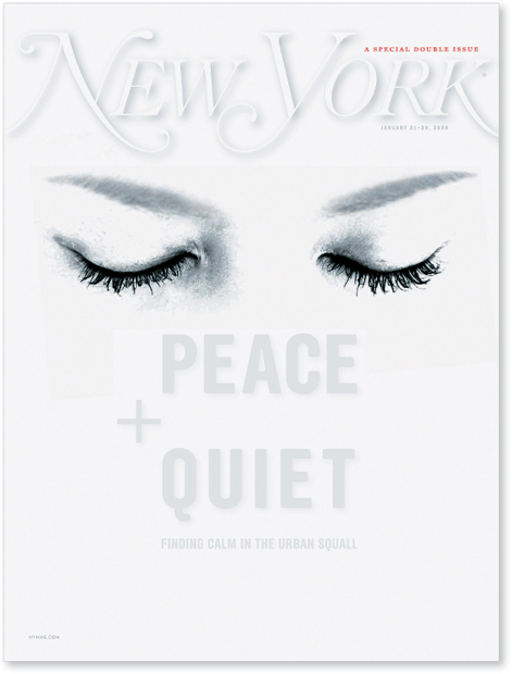
SPEAK SOFTLY AND CARRY A BIG STICK. Teddy Roosevelt’s philosophy of governing can also be applied to type usage: sometimes the best way to emphasize the content visually is with “quiet” typography. At other times, the nature of the content calls for a low-key treatment. “Softness” can be accomplished in a variety of ways: choosing a typeface with a thin stroke width, or choosing to keep contrast to a minimum. Using a small point size is another method for “invisible” typography, but remember that legibility may be impaired if these techniques are not properly executed.
Project
Cover
Design Director, Designer
Chris Dixon
Client
New York
This is a brave design for a magazine cover, though not the first to use white-on-white (that was a legendary Esquire cover). The subject matter—how to find peace and quiet and achieve serenity in a frenetic city—is perfectly addressed and supported by the logo in its near invisibility.
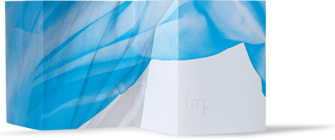
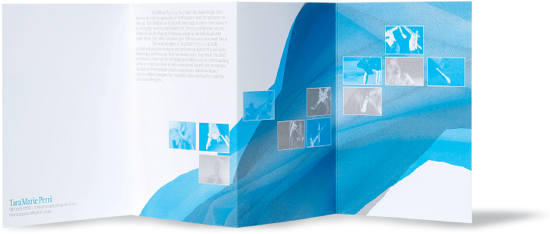
Companies
Remake Design and Mark Laughlin
Design Directors, Designers
Michael Dyer and Mark Laughlin
Client
TaraMarie Perri
The whisper of type on this layout, and the logo itself, echo the gauzy fabric image. The effect is elegant and somewhat remote.