THE LETTER
21 Thinking like a typesetter
ALL TOO OFTEN, in today’s production-streamlined world, designers are also required to be editors and typesetters. So they must be extra vigilant about rooting out double spaces, especially after periods (these introduce unsightly gaps in the text), the use of spaces instead of tabs, extra tabs, and the incorrect use of the hyphen, en dash, and em dash (the use of the double hyphen as a substitute for the em dash is an all-too-common occurrence). Pesky “invisible” or “hidden” characters like paragraph returns, soft returns, and the like can cause untold misery if not discovered before style sheets are applied.
Project
HotHouse exhibition catalog
Company
Studio of ME/AT
Art Director
Lucille Tenazas
Designer
Alexander Tochilovsky
Client
Cranbrook Art Museum
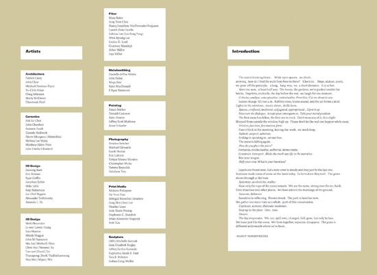
At right and opposite page: These lists and sections can be streamlined if style sheets have been properly created and applied.
Project (below)
Infographic
Creative Director
Robert Priest
Designer
Jana Meier
Illustrator
John Grimwade
Client
Condé Nast Portfolio
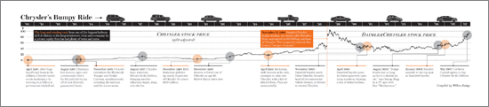
Below: This complex infographic containing stock prices, dates, and tightly tailored text blocks requires a great deal of typesetting skill to render the data clearly for the reader’s comprehension. When importing the text, it is imperative that the file be free from unnecessary tabs and spaces. Note the use of old-style numbers with upper- and lowercase text.
Company
Studio of ME/AT
Designer
Alexander Tochilovsky
Client
Cranbrook Academy of Art
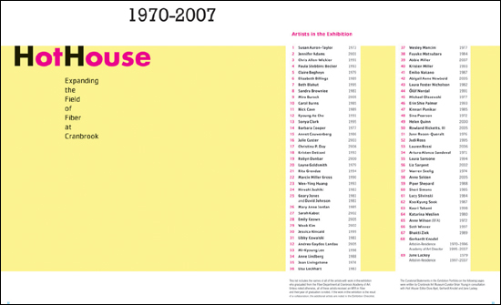
These lists and sections can be streamlined if style sheets have been properly created and applied.