THE PAGE
82 Text typefaces versus display typefaces
TEXT TYPEFACES HAVE BEEN DESIGNED with legibility and beauty as their twin goals. Most text typefaces have stood the test of time and usage as appropriate for lengthy passages of text under a variety of reading conditions and with the expectation of a broad reader demographic. Display typefaces, designed less urgently for legibility (although some are eminently legible), are more about style, so the level of legibility may be very minimal. But their raison d’être is a unique stylistic expression of content.
Project
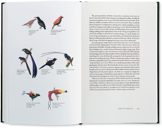
Birds of the World
Art Director
Charlie Nix
Designers
Charlie Nix, Whitney Grant, and May Jampathom
Client
University of California Press
This body copy is both legible and beautiful, not only due to the letterform details, but also in the way the text has been set. The proportions of the column width, leading, and margin spaces all contribute to the harmony of its presence on the page.
Project
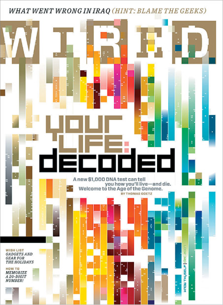
Cover
Creative Director
Scott Dadich
Design Director, Designer
Wyatt Mitchell
Illustrator
The MarkMakers
Client
Wired
Letterforms that have been chosen to emulate data are a fine display choice for the cover, but they are appropriate only for use at large sizes and with a limited amount of text.
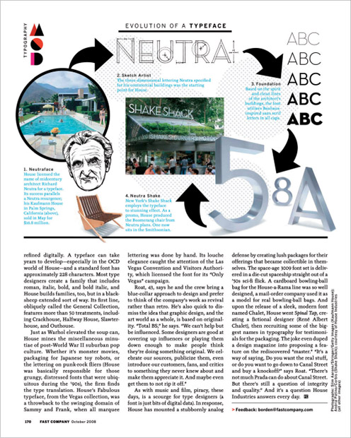
Project
Single page
Creative Director
Dean Markadakis
Designer
Jana Meier
Client
Fast Company
This excerpt from a story about a type foundry shows text type is used for the body copy, with a sidebar infographic about the creation of Neutra, a display typeface.