THE PARAGRAPH
67 Opening paragraphs
THE APPEARANCE OF THE OPENING paragraph is as important as its content in drawing the reader into the text. There are myriad interesting ways to accentuate an opening paragraph that signals the beginning of a long passage of text. Some of these design directions may involve a different column width, a different point size (or mixing point sizes), leading, changing case, or some combination of the above. Small caps may be used as a transition from the initial drop cap to the body copy within the opening paragraph.
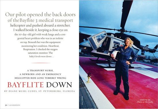
Project
Feature spread
Art Director
Francesca Messina
Designer
Donald Partyka
Client
Guideposts
An upside-down pyramid of text combines with the subhead, title, and byline to give an illusion of depth, tying in nicely with the facing photograph’s runway perspective.
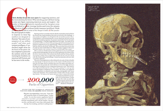
Project
Feature spread
Creative Director
Robert Priest
Designer
Jana Meier
Photographer
Chris Jordan
Client
Condé Nast Portfolio
This L-shaped opening paragraph “hugs” the following text; its slightly larger point size and wider leading, together with the bold lead-in and the large initial cap overlapping the text, leave no doubt as to where this story begins. Note the red paragraph indicator dingbat, which allows the text block to appear “solid,” i.e., without a paragraph break that would not have filled out the space.