THE PARAGRAPH
53 Less is more
SIMPLICITY HAS AN UNDENIABLE APPEAL to a time-pressured and overworked reader. A type treatment that promises to be “quick and easy” is just what the doctor ordered. Type that has minimal detail, has highly legible letterforms, and is floating in a good-sized space feels like a breath of fresh air even before we choose to read it.
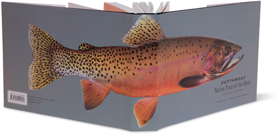
Project
Cutthroat: Native Trout of the West
Art Director
Charlie Nix
Designers
Charlie Nix and Gary Robbins
Client
University of California Press
The exquisitely rendered image is clearly the star of this jacket; the headline quietly allows the fish to take center stage. Even the choice of black for the text is restrained.
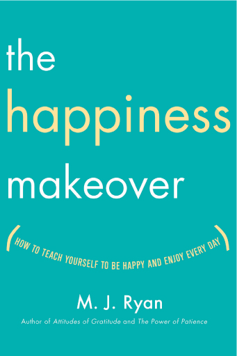
Project
The Happiness Makeover cover
Art Director
Michael Windsor
Designer
Lauren Panepinto
Client
Broadway Books
Lowercase lightweight sans serif is a simple treatment for this “happy” book jacket. The visual joke of the subhead as a smile is childlike, and the cyan background feels basic and clean.
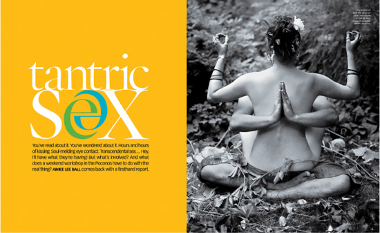
Project
Feature spread
Design Director
Carla Frank
Designer
Randall Leers
Client
O, The Oprah Magazine
Floating calmly in a sea of bright yellow, the text is low-key lowercase (with a twist, a typographical wink at sex).