THE PAGE
95 Tables and charts
THESE “INFOGRAPHICS” should be typographically related to the body copy with which they coexist. There are a number of excellent texts specializing in designing tabular material. This type of design work is a specialty all its own. However well designed tables and charts—and all info-graphics—may be, the typography must be designed with an eye toward proportional relationships and stylistic compatibility with the surrounding text.
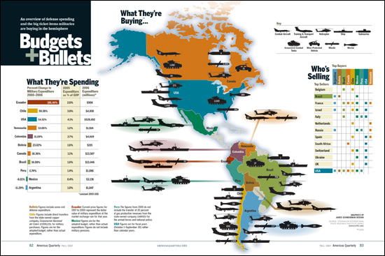
Project
Feature spread
Creative Director
Donald Partyka
Illustrator
Jared Schneidman
Client
Americas Quarterly
This complex infographic combines a number of tables and charts in a very straightforward and legible manner, using simple typestyles and plenty of space to lay out the charts, tables, and diagrams.
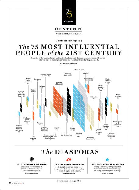
Design Director
David Curcurito
Art Director
Darhil Crook
Associate Art Director
Erin Jang
Client
Esquire
To analyze the characteristics of the subjects of a story, this infographic, set at a vertiginous tilt, slices and dices using a composite of profiles. It is stylistically in keeping with the entire issue’s package of profiles.
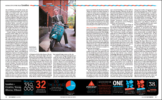
Project
Feature spread
Creative Director
Dean Markadakis
Designer
Jana Meier
Photographer
Jonathan Worth
Client
Fast Company
Lists of statistics (which can otherwise be visually boring) have been enlivened here by the use of simple graphics, changing the scale, color, orientation, and expression of numbers and text.