THE PAGE
76 Legibility, legibility, legibility
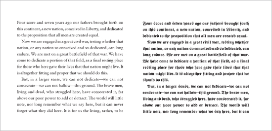
’NUFF SAID. Like real estate’s mantra (location, location, location), type exists to serve content, so its primary goal should be the ability to invite the reader to apprehend the content. Many factors can affect legibility, and the combination of factors also has an effect on legibility. Designers enamored with their own cleverness often underestimate the amount of time readers are willing to spend to get through the text. (Just because you design it does not mean they will come!)

Creative Director
Robert Priest
Designer
Jana Meier
Illustrator
Tavis Coburn
Client
Condé Nast Portfolio
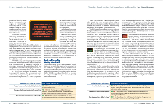
Complex stories need special clarity, not only in the legibility of the text type but also in every text element on the page. Providing mini-headlines, keying caption information using numbers or other identifiers, and highlighting important concepts all provide good service to the reader.

Project
Feature spread
Creative Director
Donald Partyka
Designer
Cathie Yun
Client
Americas Quarterly
Unbroken column after unbroken column of text can tax the reader’s attention span. Even a few simple devices like a callout, subhead, or infographic provides welcome respite from the monochromatic masses of body copy.