THE PAGE
85 Using justified type
ALIGNMENT OF THE LEFT AND RIGHT SIDES of the column, known as justified type, imparts a cool, clean, considered look to the text. It is a more formal and even a more authoritative look, so this convention is highly favored for books and newspapers but less so for magazines and other documents, which may use a mix of justified and unjustified type within their pages to indicate different types of content formats. If not well planned and tailored during editing, justified type has the potential to be “gappy” between words, as typesetting software adjusts the word spaces to achieve justification (See pages 118–119, Hyphenation and Justification.) If there are too few words in a column, there may not be sufficient opportunities for the software to apportion the spaces in a way that will retain an even typographic color throughout the passage of text.
Project
Feature spread
Creative Director
Robert Priest
Designer
Jana Meier
Illustrator
Bryan Christie
Client
Condé Nast Portfolio
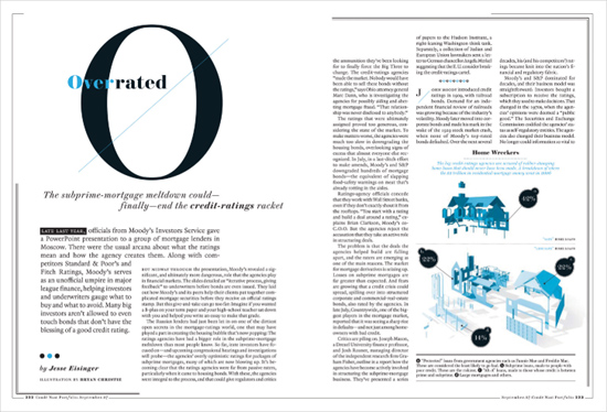
Using only two colors and an uneven column grid, this layout uses justified type to create a clean edge around the infographic and as a way of balancing special blocks. Note the use of an off-center headline and subhead to create counterpoint, and the centered text above the infographic to set it apart from the body copy.
Creative Director
Robert Priest
Designer
Jana Meier
Client
Condé Nast Portfolio
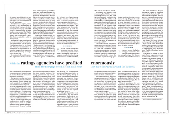
This second spread creates counterpoint to the formality of justified columns by intentionally misaligning them vertically and slicing through the columns and the gutter with a callout.