THE LETTER
11 Considering background contrast
THE DIFFERENCE BETWEEEN FOREGROUND and background totality is a key factor in legibility. The highest degree of contrast exists between black and white. Studies have shown that, while black type on a white background is highly legible, the same quantity of white type on a black background is harder to read. In large quantities, especially at text type sizes, there is a kind of “halo” or sparkle effect that impedes legibility and is actually uncomfortable to the eye.
As type color and background color come closer together in hue, saturation, and density, legibility is reduced. At a certain point where there is not enough contrast (and this point is a moving target, because it depends on many other factors, including letter weight, set width, stroke width, slope, and point size), legibility may be significantly impaired. The amount of text is a factor (a few lines might be less of a problem), the length of the lines or “measure” may be a factor, and the light conditions and paper surface may also be factors (see “Theory of Relativity I” on page 56).
Project
Feature spread
Design Director
Carla Frank
Designer
Kristin Fitzpatrick
Photographer
Gentl & Hyers
Client
O, The Oprah Magazine
The opening spread has the same type style and size under the title, but the tint changes as the type position grows lower in the page. This is a graphic demonstration of the decrease in contrast and how it can affect legibility. In this case, legibility is not an issue because the type size is still sufficiently large (but if the page were viewed from a distance, the difficulty in legibility would be apparent).
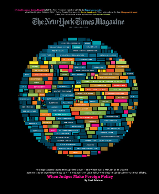
Art Director
Arem Duplessis
Designers
Arem Duplessis and Ian Allen
Client
The New York Times Magazine
This cover is a cleverly designed and pixelated typographic illustration, which also happens to illustrate how background contrast can matter: each piece of type in the blocks of color is white, but as the background changes, we can see how much more the type stands out as the background contrast increases (i.e., becomes darker).