THE PAGE
91 Decks, callouts, and pull quotes
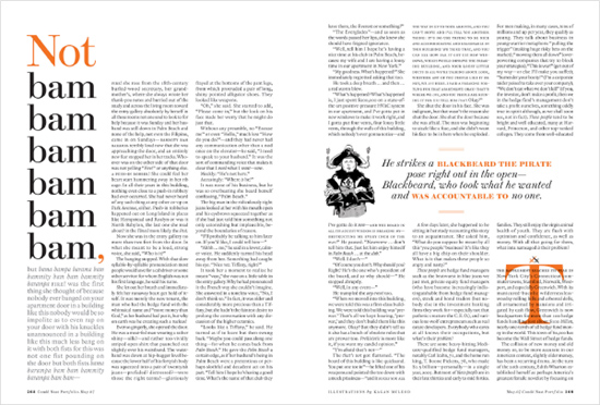
THESE FUNCTION AS ENTRY POINTS to the text for the reader who is still undecided about whether to commit to a complete article or passage of text. They can be playful or dramatic: this is a chance for the designer to take some liberties and create some typographic focal points that leap out of the background textual tonality of the content. Callouts and pull quotes may be lifted out of their context within the text and repositioned to maximize the page design, or they may be left in place and highlighted; either way, the quotes should be carefully chosen to represent the best of the body copy.
Project
Feature spread
Creative Director
Robert Priest
Designer
Jana Meier
Illustrator
Kagan McLeod
Client
Condé Nast Portfolio
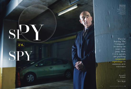
Stacked repetitive large words are certainly a way to draw the reader in; on the opposite page, the pull quote is made more interesting by shifts in typographic case, slope, and color (as well as the use of an illustration). Note the use of text overlapping an initial cap to indicate a break in the story.
Project
Feature spread
Creative Director
Robert Priest
Designer
Jana Meier
Photographer
Matt Hoyle
Client
Condé Nast Portfolio
The treatment of the deck of this opener is quiet and surreptitious, as befits the imagery and the headline treatment.