THE WORD
27 Typographic abominations
THERE ARE SOME TYPOGRAPHIC FORMS that can be considered abominations: chief among these are any forms that have been manipulated or distorted for no good creative reason. This often happens unintentionally; inexpert users may not know how to constrain proportion using the resizing tools within their software when working with type. Or it may happen intentionally when users are not educated enough about type and try to squash or stretch type to fit into a particular space; this subverts the proportions crafted by the typeface’s creator and always results in ugly, mismatched forms.
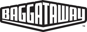
Project
Baggataway
Company
Alphabet Arm Design
Designer
Aaron Belyea
Client
Rocky Batty
The logo shape is a container, which the text is shaped to fit inside. This modest distortion is deliberate and specific to this situation.
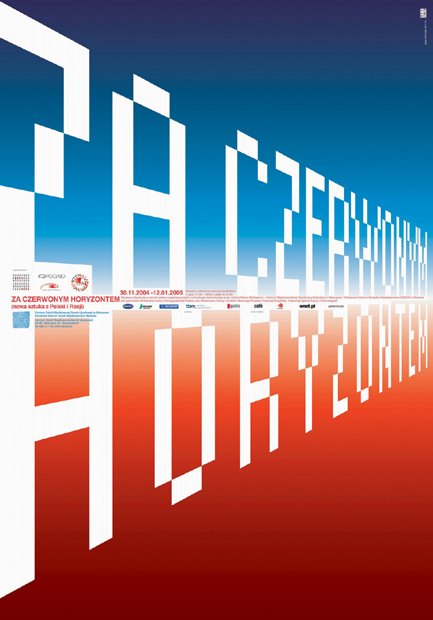
Project
Beyond the Red Horizon
Designer
Jakub Stepien
Client
Center for Contemporary Art in Warsaw
Similarly, although more simply, the type is used as art to suggest a sunset using depth, therefore the distortion serves a purpose and is executed skillfully. The small informational text supports the illusion, also receding into the distance.
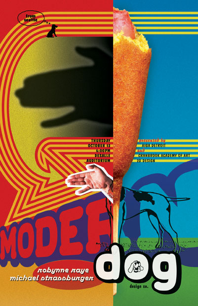
Company
Studio of ME/AT
Designer
Mike Essl
Client
Cranbrook Academy of Art
The key is the designer’s intention: stretching type to fit into a shape serves the design in this poster.