THE PARAGRAPH
63 Increasing leading
SPACE BETWEEN LINES (LEADING) should be increased if the measure (line length) increases beyond the optimum range, or if the letterforms vary even slightly from a highly legible text face (designed to be read in quantity at small sizes). Even Bodoni, with its strong vertical strokes (in comparison to its horizontal strokes), may require a bit more leading to compensate. Increasing leading, even slightly, aids the eye in finding its place when it cycles back from the end of one line to the beginning of the next.
Project
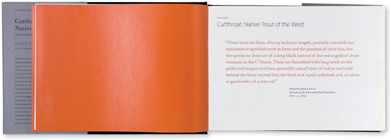
Cutthroat: Native Trout of the West
Art Director
Charlie Nix
Designers
Charlie Nix and Gary Robbins
Client
University of California Press
The longish introductory quote is more legible (and more elegantly presented) with extra leading.
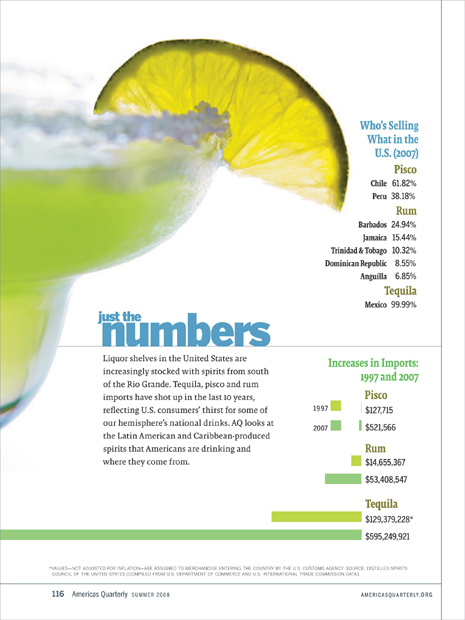
Project (opposite)
Single page
Creative Director
Donald Partyka
Client
Americas Quarterly
This airy text block has extra leading in keeping with the spacious graphic treatment and the other elements on the page.