THE LETTER
22 Using display versions
TITLING AND DISPLAY VERSIONS of text type have been designed to look good at display sizes (i.e., above 14 or 16 point); specifically, they have been refined in their details, especially in the design and weight of their serifs. Text typefaces, when enlarged to display sizes, will have thicker details; this is because the letterforms need to hold their own in body type sizes. Thus (depending on the typestyle), they may not translate especially well when enlarged beyond their intended size range. Use titling and display versions whenever possible.
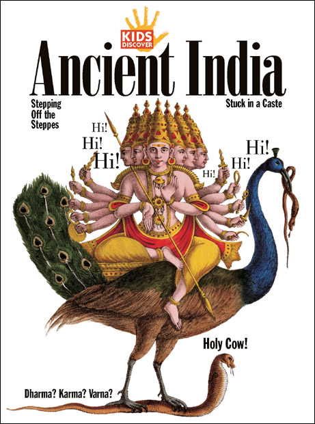
Project
Cover
Company
Hopkins/Baumann
Creative Directors
Will Hopkins and Mary K. Baumann
Images
Corbis, Historical Picture Archive
Client
Kids Discover
This condensed version of Bodoni would be inappropriate if used at text sizes; its tight counter spaces would make it difficult to read. This holds true for the sans serif type: it is too condensed for body copy, but fine for display.
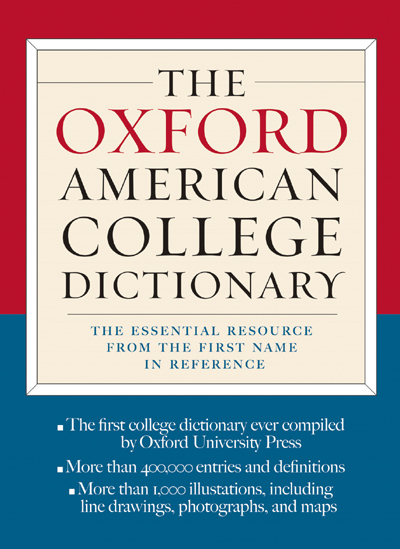
Creative Director
Donald Partyka
Client
Barnes & Noble
The delicate terminal strokes of this headline would disappear at text sizes. The typeface has been tailored for display usage.
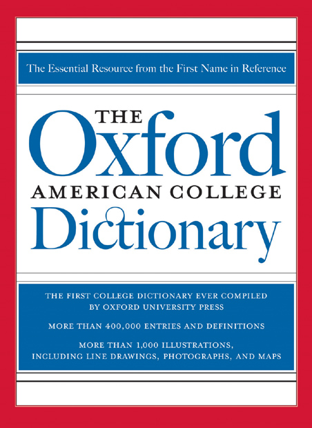
Project
Book cover
Creative Director
Donald Partyka
Client
Barnes & Noble
The finely wrought ligature between the c and the t of this headline would not be visible at text sizes. The typeface has been tailored for display usage.
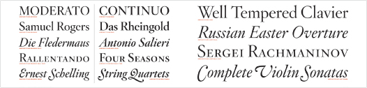
Project
Type specimen
Company
Hoefler & Frere-Jones
Designer
Jonathan Hoefler
Client
Hoefler & Frere-Jones
Hoefler Titling is the accompanying display type for Hoefler Text, an old-style typeface with a very broad range of weights.