THE PARAGRAPH
61 Basic leading principles
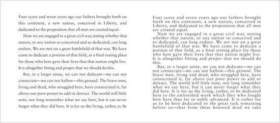
A GOOD RULE OF THUMB FOR TEXT TYPE is to add two extra points of leading. This creates a good comfort level for extended reading. However, when the typeface has strong verticals in relation to its horizontals and serifs, it will do better with a bit more leading. Extra leading adds some air between the lines and allows the eye to more easily distinguish the end of one line from the beginning of the next. The best way to determine how much leading you need for a particular passage of text is to set a good chunk of it with slight variations in leading. Even an extra quarter of a point can make a difference.
Project
Feature spread
Creative Director
Donald Partyka
Client
Americas Quarterly
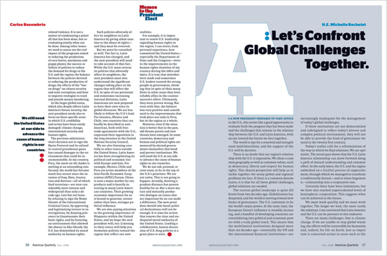
Whether two or three columns, this format has sufficient leading for good legibility. This text is also highly legible due to its size, stroke width, and weight (strong typographic color).


Design Director
David Curcurito
Art Director
Darhil Crook
Associate Art Director
Erin Jang
Design Assistant
Soni Khatri
Client
Esquire
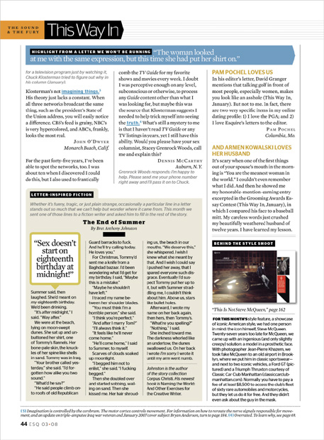
This letters page has mostly traditionally leaded text; for some of its display type (the text in the blue bar and in the thought bubble), leading has been deliberately tightened. This does not significantly impair legibility when used for effect in limited quantities and at a larger-than-body-copy point size.

