THE WORD
44 Mixing many typefaces
TYPOGRAPHIC CACAPHONY CAN BE APPEALING when in the hands of a skilled designer (otherwise it can be a nightmare of conflicting forms). Mixing many typefaces works best when there are extreme differences in the type choices; this implies intent and control underlying the mishmash. When mixing typefaces within a document, bear in mind that, as always, each choice should serve a specific need. It is never a good idea to use different typefaces for no good reason.
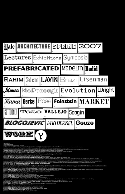
Project
Poster
Company
Pentagram
Designer
Michael Bierut
Client
Yale University School of Architecture
Twenty-eight typefaces are numbered and keyed in the text below; each represents an event or info-bit in the yearly calendar of the architecture school. The design signifies the variety of events by using a variety of typefaces. Since each is encased in its own bricklike box, there is a unity to the design. The last, a Y representing Yale, is in a circle, serving as a period or end slug.
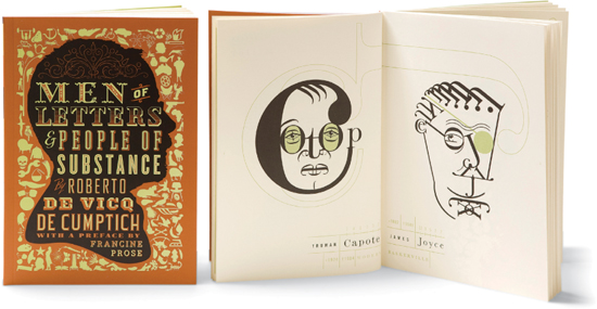
Project
Men of Letters & People of Substance
Creative Director, Designer
Roberto de Vicq de Cumptich
Client
David R. Godine, Publisher
The title, encapsulated within the silhouette of a head in profile, alludes to the content: this book contains portraits of literary figures made entirely from type characters, one font per portrait. A mosaic of dingbats surrounds the silhouette; these, too, are used for portraiture in the book.
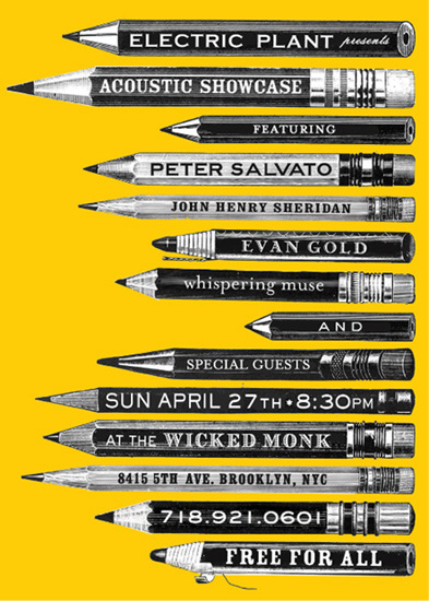
Project
Acoustic Showcase poster
Designer
Lauren Panepinto
Client
Electric Plant
An irregular collection of pencils serves as text placeholders for an invitation; because each pencil is different in function and style, the typeface used on each pencil is different. The multiplicity of typefaces works because each is confined in its own space and shape.