THE WORD
41 See the shape
WITH CENTERED ALIGNMENT, or with any ragged edge, “bad rags” can be a problem. Always look for a balanced rag, one that does not inadvertently create a shape. When deliberately creating a shape from type, a skilled designer will fill the shape with type in such a way that its texture is consistent, without gaps or heavy spots. (See “Theory of Relativity II” on page 106.)
Project
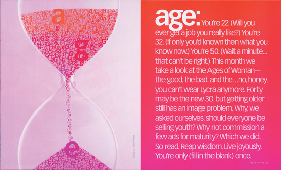
Feature spread
Design Director
Carla Frank
Designer
Kristin Fitzpatrick
Client
O, The Oprah Magazine
The sands of the hourglass, shaped by using letters as sand, illustrate a story on aging.
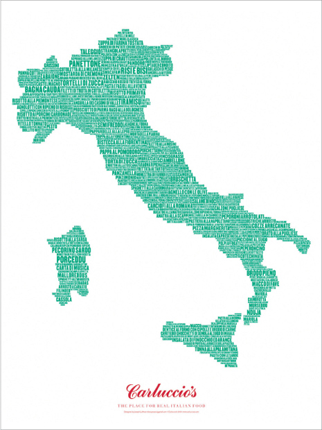
Design Director, Designer
Joseph Luffman
Client
Carluccio’s
A map of Italy for a food purveyor is built from the names of Italian dishes. Because the letters are all caps, they can be tightly stacked; a compressed letterform creates visual bulk; different sizes and orientation are used to vary the texture and create separation without extra spaces, so the shape can be tightly constructed.
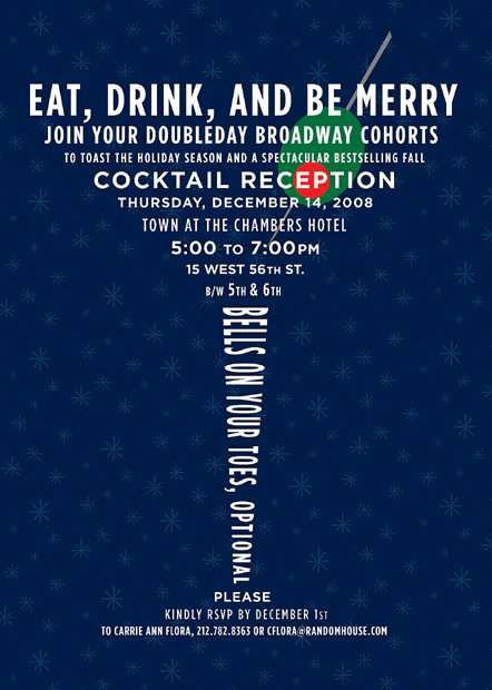
Project
Doubleday Christmas party invitation
Designer
Lauren Panepinto
Client
Doubleday In-House
Cocktails, anyone? This delightful martini glass concocted from the text of the invitation incorporates the information neatly; the airy leading suggests the lightness of the liquid in the glass.