THE PAGE
81 A need for every typeface
NO MATTER HOW BIZARRE or how extreme its forms, somehow, somewhere, there is a purpose for every typeface under the sun. The tricky part is knowing where and how to use a typeface for the very purpose that suits it. The vast universe of available typefaces can be daunting when searching for just the right style to advance the meaning of the text. Ideally, an appropriately designed typeface will do dual service as an image and to convey information. The best typographic designs advance the message on many levels. Some display faces are so specific that they almost demand a unique use, and to try to force them into doing and saying something that they were not meant to do is practically impossible.
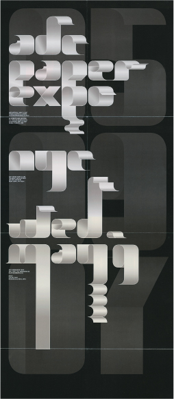
Project
Paper Expo poster
Designers
Tiziana Haug and Steve Rura
Client
The Art Directors Club
The typeface, custom-designed for this project, intended to capture the feeling of paper unfurling. Haug calls it, “a study of the interaction between light and paper, and the transformation of a 2-D to a 3-D object. The poster originated through a joined effort between Steve Rura and myself. We took turns drawing and redrawing letterforms until we achieved the right balance between the visual consistency of a typeface and the looser, less predictable qualities of curling paper.”
Project
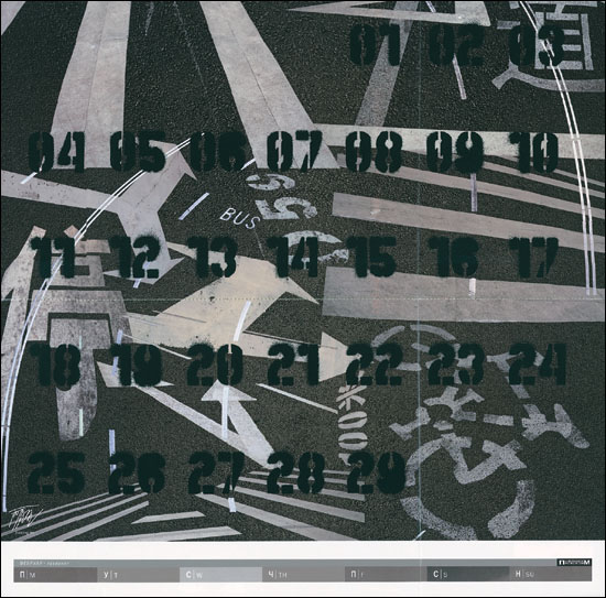
Guide for Living 2008
Designer
Jianping He
Client
Publikum Calendar
The typeface for this calendar page emulates stenciled spray-painted graffiti-style forms; the numbers merge seamlessly with the asphalt signage embedded in the imagery. This is perhaps the only perfect use for these letterforms.