THE LETTER
25 Theory of Relativity I
LETTERS EXIST IN RELATION to other letters. Therefore, every design decision is dependent on the specific set of circumstances governing the letter’s context. In other words, it reacts to, and should be considered in relation to, its design environment. This is what makes it so difficult to provide an immutable set of rules about type usage—every set of circumstances is different, if only slightly. Moreover, there are often many successful ways to get it right, but usually even more ways to get it wrong.
Project
Feature spread
Creative Director
Scott Dadich
Designer Director
Wyatt Mitchell
Designer
Christy Sheppard
Illustrators
Bryan Christie and Thomas Porostocky
Client
Wired
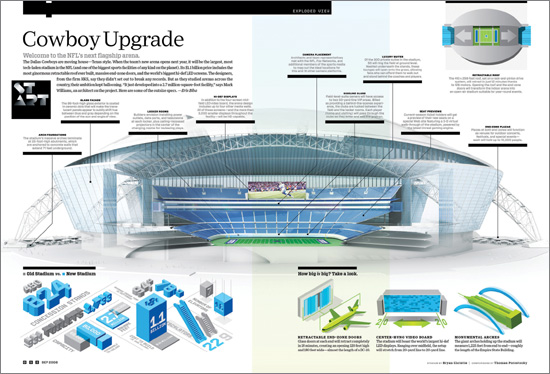
This complex spread contains a large amount of content; the text is carefully balanced with the other visual elements to fill the space comfortably, but not too tightly. Multiple levels of information hierarchy have been carefully tailored to keep the text distinct yet harmonious with the whole. Of particular interest are the centered captions sitting on a black bar, which point to elements in the center visual.
Company
Mucca Design
Creative Director
Matteo Bologna
Art Director, Designer
Andrea Brown
Client
Sant Ambroeus
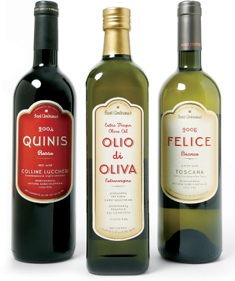
The centered text on these labels has many levels of information; the size, weight, and contrast of the levels of information have been carefully calibrated, and the spaces between the lines have been subtly manipulated to create separation while maintaining a cohesive vertical column of text.
Project
Feature spread
Creative Director
Donald Partyka
Illustrator
Jared Schneidman
Client
Americas Quarterly
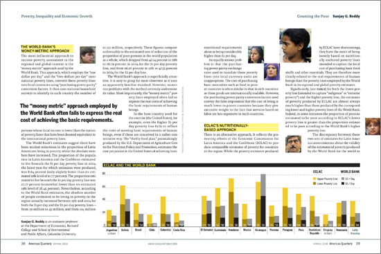
In addition to the running text, the spread contains an author bio, a callout, two subheads, an infographic, credit information, and folios; all of these typographic elements work harmoniously, with generous margins and gutters.