INTRODUCTION
Typography Essentials is an effort to distill, organize, and compartmentalize–but not to oversimplify–the many complex issues surrounding the successful and effective use of typography. It is for designers of every medium in which type plays a major or minor role.
A deep understanding of letterforms and knowledge of the effective use of letterforms can only be obtained with constant observation and experimentation; it evolves over a lifetime of design practice and study. This book is intended to advance the progress of designers seeking to deepen their typographic expertise; it is organized and designed to make the process enjoyable and entertaining, as well as instructional.
The principles are divided into four sections: The Letter, The Word, The Paragraph, and The Page. Each of the 100 principles has a spread with an explanation and examples representing the principle in action.
You will notice that in some cases, the principles will contradict one another. Contradiction is inherently necessary because many, if not most, highly renowned and award-winning typographic designs flout the basic rules of any Type 1 class. This is, of course, why it is so important to know the rules in the first place. As my calligraphy teacher, Donald Jackson, so eloquently observed: “All rules can be broken in the most divinely successful ways.”
This sentiment has been expressed in many forms by prominent designers, yet it leads beginners to think that there really are no hard and fast rules. Nothing could be further from the truth. In fact, there are myriad rules that govern the use of type, rules that most professionals completely agree upon. As design schools and design students chafe under the yoke of teaching and learning those rules, type can be one of the most disliked (indeed, feared) components of design. And yet, it is the most crucial aspect of almost all design-related projects.
I believe that those who possess finely honed typographic skills have an enormous advantage in the workplace, whether they are newly graduated designers or mid-career professionals. Typographic skills are eminently transferable across all media, but few designers have a true grounding in typographic essentials, so that those who do immediately stand out from the crowd.*
Despite the exponentially expanding number of available typefaces, the essential principles of good typographic design remain largely unchanged, though styles reflective of the zeitgeist may change the ways in which those principles are employed. Even as the evolution of media platforms where type plays a role has grown to include computer screens, interactive interfaces, and mobile computing devices, designers must still respond to the same human factors that have always governed sound typographic choices. In fact, as baby boomers age and their eyesight degrades, and as smaller devices demand greater legibility under multiple viewing conditions, the challenges have never been greater for designers.
Just as some principles may be contradictory, there is, inevitably, some overlap among the four sections of typographic principles in Typography Essentials. And, while there is no single volume that can convey the vast body of information about typography, I hope this book will play a significant role in continuing typographic education with clarity and easy comprehension for designers at all levels.
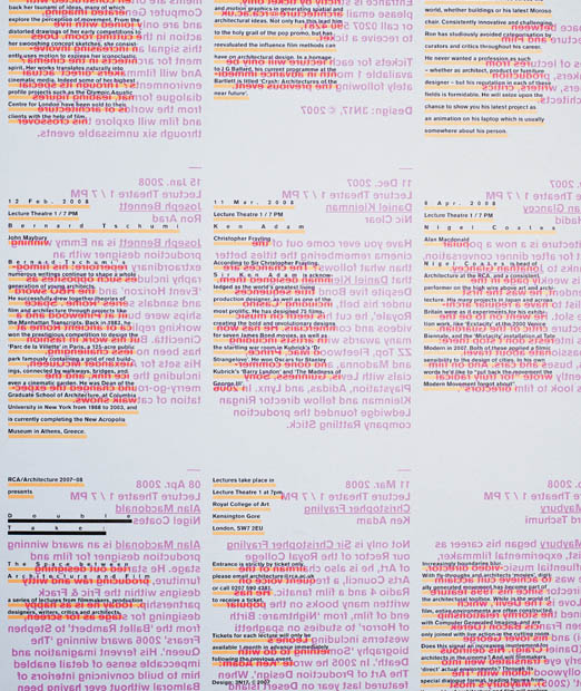
Project
Double Take
Design Director
Quentin Walesch
Designer
Quentin Walesch
Client
Royal College of Art, London

