THE PARAGRAPH
64 Tightly stacked lines
DECREASING LEADING and purposefully allowing ascenders and descenders to touch or even overlap should never be done with extended passages of text, but this can be used as a design device in limited quantities. Tightly stacked lines of capitals may be used to create a typographic mass without the worry of tangled extenders, but again, this is best when used only for a small quantity of text. Tightly stacking lines works against legibility, so care must be taken to employ this technique with restraint. When estimating just how much legibility may be affected, it is best to err on the side of minimally decreased leading.
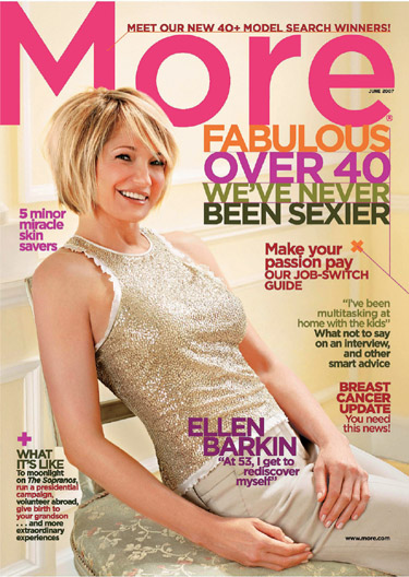
Project
Cover
Creative Director, Designer
Maxine Davidowitz
Photographer
Firooz Zahedi
Client
More
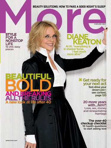
Project
Cover
Creative Director, Designer
Maxine Davidowitz
Photographer
Lorenzo Agius
Client
More
Tightly stacked and justified main cover lines became the hallmark of these covers aimed at older women; despite touching letters, they are still eminently legible, partly due to differentiating each line with a distinct color. The touching lines sets this text block apart from the other cover lines; this was intentionally done because the main lines contain the magazine’s mission statement rather than highlighting content.
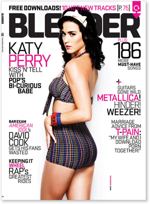
Creative Director, Designer
Dirk Barnett
Photographer
Ben Watts
Client
Blender
Aimed at a young adult audience, these cover lines are also tightly stacked but are less regimented in their justification; the odd word goes its own way here and there to add a bit of quirkiness.