THE PARAGRAPH
72 Text overlapping images
LEGIBILITY ISSUES come into play when type overlaps images: the image demands our attention. To make the type stand out, type size and style, contrast with the background, and stroke weight all contribute to the important separation between the background and the foreground. Laying a few words of display type over an image can be complex enough, but where some designers go wrong is laying a quantity of text type over an image—this is sure to make reading a difficult task.
Project
Covers
Creative Director, Designer
Steven Hoffman
Client
Sports Illustrated
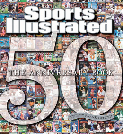
These covers demonstrate some good techniques for making sure that type is legible when overlapping complex details and many levels of contrast. The type must have enough weight and be large enough to stand apart from the images, but that is not always sufficient. A combination of outlines and hard and soft drop shadows provide separation and “lift” the text visually forward from the images.


