THE PARAGRAPH
54 More is more
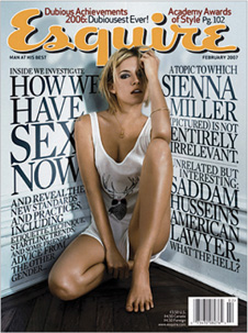
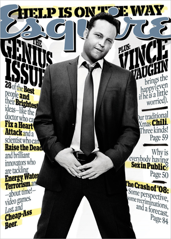
A SMORGASBORD OF CONTENT served up to the reader feels bountiful, and the urge to overstuff ourselves is ever so tempting. A plethora of choices competing for attention may deter timid or tired readers, but its main advantage is that this approach offers many opportunities for the reader to find something of interest. This is the theory behind magazine covers with many layers of cover lines, and newspapers that display as many stories as possible on their front pages.
Design Director, Designer
David Curcurito
Photo Editor
Nancy Jo Lacoi
Photographer
Mark Hom
Client
Esquire
Photographer
James White
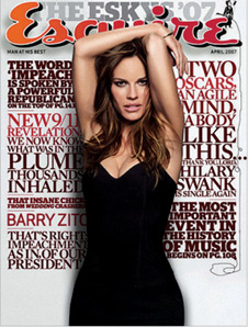
Photo Editor
Michael Norseng
Photographer
Jake Chessum
Esquire’s jam-packed cover typography treatment was almost revolutionary when it first appeared; because it is so typographically different from all of the other covers on the newsstand, it defined its own niche and became an instant classic.
Project
Covers
Art Director, Designer
Donald Beekman
Illustrator
Donald Beekman
Client
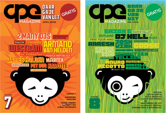
APE
A lively and intense mix of stories fight for attention on these charmingly illustrated magazine covers. While staying within a limited color and typographic palette, these jostling and unconventional cover lines convey a sense of youthful fun, and the idea that a great deal of content is waiting inside for the reader.
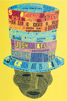
Project
Poster
Company
Henderson Bromstead
Art Co.
Client
Wake Forest University
Hand lettering taken to the max is this poster’s strength; a clean silhouette on a bright background intensifies the information overload within the shape. Cutout letters, outlined letters, script, and every manner of letterform can be found here.