THE LETTER
7 Honoring dignity
ONE OF THE MOST ELOQUENT DEFENDERS of excellence in typography is Robert Bringhurst. In his seminal text, The Elements of Typographic Style, Bringhurst frames the notion of honoring the dignity of the text in a twofold manner; briefly, it is this: the text (the content) is paramount, and all else exists to honor it, but letters also have their own life and dignity. Clarifying and ennobling “important” text is an honorable goal, to be sure. And even simple informational texts such as bus schedules and telephone directories deserve to be handled with typographic care and attention.
In a perfect world, all content would be worthy of being honored, but we know too well that a great deal of content is trivial, redundant, badly composed, witless, even despicable. What, then, is our responsibility to the text? How often have we seen film credits that were beautifully done, for films with no artistic merit whatsoever? How often have we seen a well-designed book jacket and been utterly disappointed with its contents? Or enjoyed an elegantly presented menu before discovering that the restaurant’s cuisine was inedible? As designers, we all make moral choices (is this worthy of my talent?) and practical decisions (will I lose my job/client if I turn down this assignment?), but one way to think about honoring the text is akin to the way defendants are treated under U.S. law: everyone is entitled to legal representation and a fair trial, innocent until proven guilty.
Project
Homepage
Company
FusionLab
Designer
Alon Koppel
Client
Architectural Digest
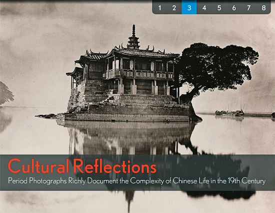
The simple geometric sans serif titling, isolated in its own stripe of tone, floats above the image much as the island of the image floats in the water. Its quiet forms act in harmony with the quietness of the sepia-toned image.

Project
CWS Capital Partners Annual Report
Art Director
Michael Stinson
Designers
Claire De Léon and Michael Stinson
Illustrators
Steven Noble and Angela Kim
Client
CWS Capital Partners
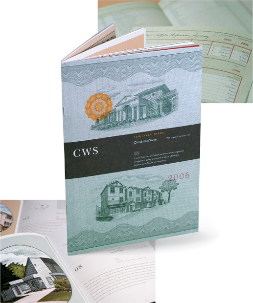
This investment firm wishes to convey authority, integrity, and reliability through its use of classic old-style serif typography. Though the firm is not that old, the type treatment suggests that they have been around for a long time.

