THE PAGE
84 Systematizing hierarchy
WHEN A DOCUMENT HAS A REPETITIVE hierarchy, an important function of the design is to make that hierarchy clear to the reader. The trick is to make the system work in all possible iterations within the document. The designer must assess all of the text and identify the worst-case scenarios (usually in terms of length) to make the hierarchy systematically cohesive.
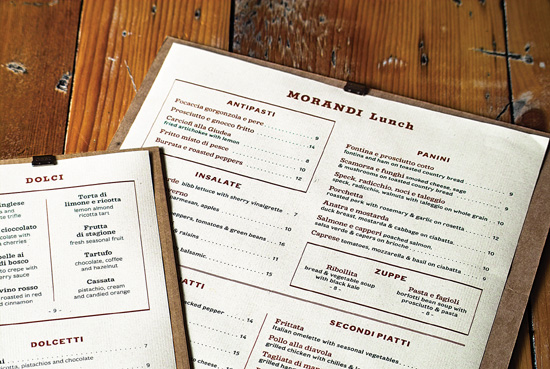
Project
Menu design
Company
Mucca Design
Creative Director
Matteo Bologna
Designer
Andrea Brown
Client
Morandi
A menu can be a tricky piece of design; many levels of hierarchy must be identified and fit into a fairly compact, yet highly legible form. In addition, the typical low lighting of a restaurant environment may present a challenge to the reader.
Project (opposite)
Single page
Design Director
David Curcurito
Art Director
Darhil Crook
Associate Art Director
Erin Jang
Design Assistant
Soni Khatri
Client
Esquire
This formatted monthly magazine page uses a flexible grid to accommodate more than a dozen pieces of text. Every month the vocabulary changes, but the complex repetitive hierarchy is always apparent to the reader through shifts in weight, case, size, and style. Note this example of “the rule of three typefaces”; even using only two colors, there is a wide range of possible typographic effects.