THE LETTER
4 Emotional content implied by the text
LETTERFORMS CAN AMPLIFY the emotional weight of the text. The delicate tracery of a flowing italic might best convey a poem about nature. The chest-thumping proclamations of a heavy slab serif might punch up a political pronouncement. The rational intellectualism of an old-style typeface might add credibility to a well-reasoned debate. The proper choice of typeface is therefore essential to the tenor of the message, and it may add to—or, if a poor choice, may detract from—the believability of the text.
Other factors play into emotional content. Rounded shapes and lighter weights might convey a more feminine touch, such as those used on most cosmetic packaging. The opposite is generally true for products appealing to a male demographic: these would typically have more weight, and be more squared off and “muscular” in appearance. The color of the type affects its emotional content, too. We think of warmer or more subdued shades as more feminine; primary colors as appealing to children; deep burgundies, forest greens, and navy blues as more masculine. Yes, these are stereotypes, but stereotypes exist for a reason and can be used very successfully to appeal emotionally to a specific audience.
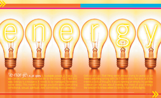
Project
Feature spread
Design Director
Carla Frank
Designer
Kristin Fitzpatrick
Client
O, The Oprah Magazine
Six lightbulbs whose glowing filaments spell out the word energy embody the concept literally and figuratively. The colors and the approach used here give us a positive and warm feeling.
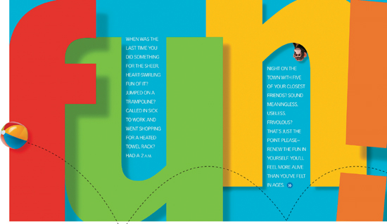
Design Director
Carla Frank
Designer
Kristin Fitzpatrick
Client
O, The Oprah Magazine
Enormity of scale, festive colors, a bouncing beach ball to increase the contrast in scale—this is an example of a word that says “fun” even if you can’t read at all. Drop shadows add dimension, an n that is bouncing above the baseline, a tilted exclamation point—all of these details contribute to the lively effect. Here the counter spaces serve as vessels for introductory text.
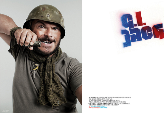
Project
Feature spread
Creative Director, Designer
Dirk Barnett
Photographer
Gavin Bond
Client
Blender
Crudely “spray painted” stenciled letterforms convey “military property.” Their placement, tilt, and haphazard color all work seamlessly with the image to convey a nervous humor: the pin is being removed from the grenade and we can imagine what happens next.