THE WORD
40 Vertical stacking
OFTEN DONE FOR THE SAKE OF CONVENIENCE or because of ignorance, vertical stacking is generally inadvisable. Because different letters have significantly different widths, centered vertical stacking creates ugly shapes with neither vertical nor horizontal alignment. A much better solution is simply to turn the type on its side so that its baseline remains intact (this helps the reader, too). However, as with all rules, this rule, too, can be successfully broken.
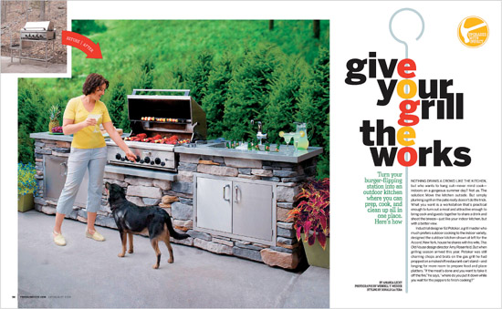
Project
Feature spread
Design Director
Amy Rosenfeld
Art Director
Hylah Hill
Photographer
Wendell T. Webber
Client
This Old House
This clever headline treatment vertically “skewers” letters colored to look like vegetables ready for the backyard barbecue.
Company
Alphabet Arm Design
Art Director
Aaron Belyea
Designer
Ryan Frease
Client
Zach Gehring
When letters are enclosed in consistent shapes, their differing widths become less obvious and alignment is less of a legibility issue (it helps when the words are short).

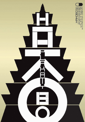
Project
Hakobo
Designer
Jakub Stepien
Client
Z.o.o. Gallery in Warsaw
The concept for this exhibition poster was a temple created with vertically stacked letters representing ascending levels of work. Here, the concept trumps legibility, so the text is repeated at upper right.