THE WORD
47 Familiarity breeds legibility
LEGIBILITY IS PARAMOUNT in most type-driven projects, so be careful to choose typefaces with design elements that are easy for the reader to grasp immediately. Many typefaces, because of their frequent usage and wide availability, have especially recognizable features and proportions. Readers should be able to “decipher” the letterforms within a split second. As with all things, our comfort level is determined by previous experience.
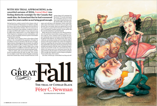
Project
Feature spread
Art Director, Designer
Louis Fishauf
Illustrator
Anita Kunz
Client
Toronto Life
Clarity in text and display type, combined with spacious margins, make this an easy read.
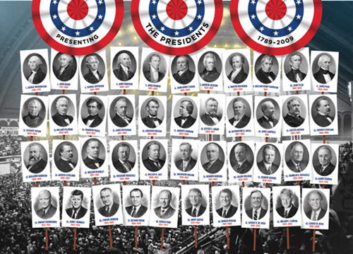
Project
Feature infographic spread
Company
Hopkins/Baumann
Creative Directors
Will Hopkins and Mary K. Baumann
Illustrators
John Baxter and Bureau of Engraving and Printing
Client
Kids Discover
This spread uses an iconic typeface often seen in election memorabilia; our familiarity with this presentation ensures legibility.