
A Pareto chart is a bar chart that is displayed in descending order by default. It is typically used to display the largest defect types. Here, we will create a Pareto defect chart with a frequency column. The data used in this example will look at manufacturing defects for textiles.
Column 1 contains the nature of the defect and column 2 contains the number of defects recorded.
The following instructions will create a Pareto chart from a table of defect and frequency:
- Go to the File menu and select Open Worksheet….
- Click on the button labeled Look in Minitab Sample Data folder and then open the
ClothingDefect.MTWworksheet. - Go to the Stat menu and select Quality Tools… and then select Pareto Chart….
- In the Defects or attribute data in: section, enter
Defect. - In the Frequencies in: section, enter
Count. - Select the Do not combine option and click on OK.
Pareto charts always order the bars in descending order, showing the highest frequency first with the cumulative frequency displayed by the red line, as shown in the following screenshot:
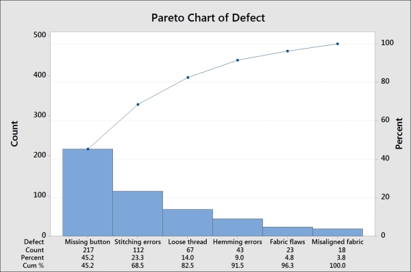
The data shown in this example was created as a table using types of defect and its frequency. Alternatively, the data could be left as a raw format and the Pareto chart command would count up the occurrence of each category.
The BY variable in: section can be used to split the chart out into separate graphs. This is useful if, for example, we wanted to show Pareto charts for different departments.
The Combine remaining defects into one category after this percent: and Do not combine options can be used to tidy up a graph. Combining the smallest categories into one column called Other is a great way to shrink a large number of small defect types into one category. When creating a Pareto chart, this is initially set to 95 percent. This means that a chart will show up only when the category crosses 95 percent; it will include only this category in the chart. Everything else will be put into a remainder bar called Other.
A weighted Pareto chart can be created by looking at the cost or value. Here, we have results of total cost in column 4. By using this column instead of the frequency, the Pareto chart shows us the most categories with the most costly defect first.
If we have a worksheet without a total cost column, we will use the calculator to multiply them together.
- The Calculator – basic functions recipe in Chapter 1, Worksheet, Data Management, and the Calculator
- The Creating bar charts of categorical data recipe
- The Creating a bar chart with a numeric response recipe